如何在 ggplot2 R 圖中設定軸的範圍
Gustavo du Mortier
2024年2月16日
R
R Plot
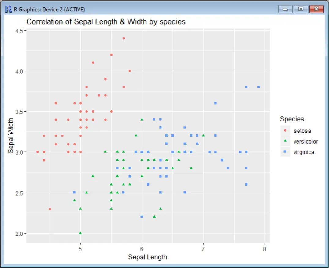
首先讓我們看一下我們的散點圖,不對軸施加任何限制。在這個例子中,我們使用 Iris 資料集來關聯萼片寬度值和萼片寬度,按顏色對物種進行分類。在呼叫 ggplot 函式之前,我們需要安裝 ggplot2 包,並載入相應的庫。
install.packages("ggplot2")
library(ggplot2)
scatter <- ggplot(data=iris, aes(x = Sepal.Length, y = Sepal.Width))
scatter + geom_point(aes(color=Species, shape=Species)) +
 ylab("Sepal Width") + xlab("Sepal Length") +
 ggtitle("Correlation of Sepal Length & Width by species")
輸出:
現在,假設我們想限制 x 軸(萼片長度),使圖形只顯示 x=5 和 x=7 之間的區域。我們有兩個選擇:使用 scale_x_continuous 或使用 coord_cartesian。
scale_x_continuous 刪除所有落在給定軸指定範圍外的資料點,而 coord_cartesian 只調整可見區域。在大多數情況下,這兩個選項會呈現相同的結果。但如果你碰巧對資料進行了一些擬合,那麼擬合的值可能會改變。
用 ggplot2 中的 scale_x_continuous 設定 x 軸的限制
要使用 scale_x_continuous,你需要指定一個 X 軸的下限和上限的向量,像這樣。
scatter <- ggplot(data=iris, aes(x = Sepal.Length, y = Sepal.Width))
scatter + geom_point(aes(color=Species, shape=Species)) +
 ylab("Sepal Width") + xlab("Sepal Length") +
 ggtitle("Correlation of Sepal Length & Width by species") +
 scale_x_continuous(limits = c(5, 7))
輸出:

我們還會收到一條警告資訊,告訴你有多少資料點被從圖形中刪除。
Warning message:
Removed 34 rows containing missing values (geom_point).
如果我們也想限制 Y 軸,可以用同樣的方法新增 scale_y_continuous,就像這個例子。
scatter-<--ggplot(data=iris,-aes(x-=-Sepal.Length,-y-=-Sepal.Width))
scatter + geom_point(aes(color=Species, shape=Species)) +
ylab("Sepal Width") + xlab("Sepal Length") +
ggtitle("Correlation of Sepal Length & Width by species") +
scale_x_continuous(limits = c(5, 7)) +
scale_y_continuous(limits = c(2.5, 4))
輸出將顯示兩個軸的範圍限制。

你也可以使用速記函式 xlim 和 ylim 代替 scale_x_continuous 和 scale_y_continuous 來使命令更短一些。
scatter <- ggplot(data=iris, aes(x = Sepal.Length, y = Sepal.Width))
scatter + geom_point(aes(color=Species, shape=Species)) +
  ylab("Sepal Width") + xlab("Sepal Length") +
  ggtitle("Correlation of Sepal Length & Width by species") +
  xlim(5, 7) + ylim(2.5, 4)
使用 coord_cartesian 來限制 ggplot2 中的兩個軸
如果你想用 coord_cartesian 代替 scale_x_continuous 和 scale_y_continuous,命令將是這樣的。
scatter <- ggplot(data=iris, aes(x = Sepal.Length, y = Sepal.Width))
scatter + geom_point(aes(color=Species, shape=Species)) +
 ylab("Sepal Width") + xlab("Sepal Length") +
 ggtitle("Correlation of Sepal Length & Width by species") +
 coord_cartesian(xlim = c(5, 7), ylim = c(2.5, 4))
而且圖形輸出也是一樣的。
在 RStudio ggplot2 的攻略中,你可以找到該命令所有選項的使用說明。
Enjoying our tutorials? Subscribe to DelftStack on YouTube to support us in creating more high-quality video guides. Subscribe