在 PHP 中繪製圖形
本文介紹瞭如何在 PHP 中使用 pChart 建立圖形。第一個是條形圖,第二個是樣條圖,最後一個是來自 MySQL 的直方圖。
設定你的環境
在使用 pChart 之前,你首先需要安裝 PHP5。你可以從 SourceForge 獲得 PHP5 作為 XAMPP 5.5.28 的一部分。
當你有 XAMPP 5.5.28 時,從他們的官方網站下載 pChart。之後,將 pChart 提取到 XAMPP 5.5.28 的 htdocs 資料夾中。
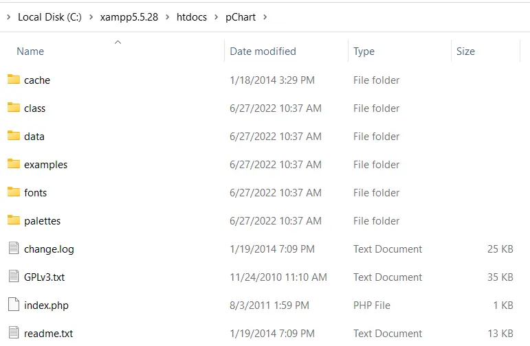
開啟 pChart 資料夾,其結構應如下圖所示:
注意:
class資料夾包含我們將使用的類定義。fonts資料夾包含我們可以在圖表中使用的字型檔案。
完成 pChart 設定後,你現在可以開始繪圖了。
在 PHP 中使用 pChart 繪製條形圖
使用 pChart 繪製條形圖的 PHP 程式碼必須包含 class 資料夾中的三個檔案。這些檔案是:
pData.class.phppImage.class.phppDraw.class.php
在這些檔案中,pData.class.php 允許你載入將在圖表中使用的資料。你需要 pDraw.class.php 來繪製圖表。
接下來,pImage.class.php 將讓你在 Web 瀏覽器中呈現圖表。你必須使用 PHP required_once() 包含這些檔案。
你可以使用相對路徑包含它們或定義一個 PCART_PATH 常量。然後使用 set_include_path(),你可以為 pChart 類使用短目錄名稱。
話雖如此,我們可以使用以下步驟建立帶有 pChart 的條形圖:
-
定義
PCART_PATH常量。 -
使用
set_include_path()作為pChart類的短目錄名稱。 -
使用
required_once()包含pChart類。 -
建立一個新的
pData物件。 -
建立你的資料或將其匯入。
-
使用
addPoints方法將資料新增到pData物件。 -
使用
pImage物件為圖表建立影象。 -
設定圖表的字型。
-
使用
pData的setGraphArea方法設定圖形區域。 -
使用
pData的drawScale和drawBarChart方法繪製刻度和條形圖。 -
傳送標頭資訊以告訴瀏覽器你正在傳送影象。
-
使用
pData的Render方法渲染影象。確保將null傳遞給Render方法。
以下是這些步驟的實現。以下是 Firefox 101.0 中的輸出影象。
<?php
    // The definition of the PCHART_PATH assumes
    // you have pChart one directory above your
    // current working folder.
    define("PCHART_PATH", "../pChart");
    set_include_path(get_include_path() . PATH_SEPARATOR . PCHART_PATH);
    // Since we have defined the path, and used
    // the get_include_path() function, we can
    // reference the class folder without writing
    // its full path.
    require_once "class/pDraw.class.php";
    require_once "class/pImage.class.php";
    require_once "class/pData.class.php";
    // Create the pChart Object
    $pchart_data = new pData();
    // Some sample data that we'll use to plot
    // the bar chart.
    $sample_data_set = [5, 4, 3, 2, 1, 9, 10, 12];
    $pchart_data->addPoints($sample_data_set);
    // Create the pChart Image. The first two argument
    // to the pImage object are the width and height
    // of the rendered chart.
    $pchart_image = new pImage(500, 300, $pchart_data);
    // Set the font.
    $pchart_image->setFontProperties(
    ["FontName" => PCHART_PATH . "/fonts/Forgotte.ttf",
    "FontSize" => 16]
    );
    // Define the graph area. The first two arguments
    // are the x-coordinates. While the last two are
    // the y-coordinates.
    $pchart_image->setGraphArea(35, 25, 475, 275);
    $pchart_image->drawScale();
    $pchart_image->drawBarChart();
    // Render the chart as a PNG image
    header("Content-Type: image/png");
    $pchart_image->Render(null);
?>
輸出:

在 PHP 中使用 pChart 繪製樣條圖
繪製樣條圖的過程與繪製條形圖的過程相同,不同之處在於你使用 drawSplineChart 方法繪製樣條圖。此外,你可以選擇不將圖表作為影象傳送。
相反,你可以選擇 pData 的 Stroke 方法在 Web 瀏覽器中呈現圖表。
以下程式碼使用 pChart 繪製樣條圖。此外,我們使用的是 fonts 目錄中的 MankSans.ttf 字型。
<?php
    // The definition of the PCHART_PATH assumes
    // you have pChart one directory above your
    // current working folder.
    define("PCHART_PATH", "../pChart");
    set_include_path(get_include_path() . PATH_SEPARATOR . PCHART_PATH);
    // Since we have defined the path, and used
    // the get_include_path() function, we can
    // reference the class folder without writing
    // its full path.
    require_once "class/pDraw.class.php";
    require_once "class/pImage.class.php";
    require_once "class/pData.class.php";
    // Create the pChart Object
    $pchart_data = new pData();
    // Some sample data that we'll use to plot
    // the spline chart.
    $pchart_data->addPoints([4,2,1,4]);
    // Create the pChart Image. The first two argument
    // to the pImage object are the width and height
    // of the rendered chart.
    $pchart_image = new pImage(700, 220, $pchart_data);
    // Set the font.
    $pchart_image->setFontProperties(
        ["FontName" => PCHART_PATH . "/fonts/MankSans.ttf",
        "FontSize"=> 18]
    );
    // Define the graph area. The first two arguments
    // are the x-coordinates. While the last two are
    // the y-coordinates.
    $pchart_image->setGraphArea(60, 40, 670, 190);
    $pchart_image->drawScale();
    $pchart_image->drawSplineChart();
    // Draw the chart as a stroke.
    $pchart_image->Stroke();
?>
輸出:

在 PHP 中從 MySQL 資料庫中繪製柱狀圖
繪製直方圖遵循與條形圖和樣條圖類似的步驟。但是,有一些差異值得指出。
首先,直方圖的資料將來自 MySQL。這意味著你應該有一個包含一些示例資料的資料庫。
其次,你將使用表列名稱作為直方圖上的軸。為此,你將使用一些 pData 方法,例如 setAbscissa、setSeriesOnAxis 和 setAxisName。
現在,建立一個名為 weather_measurements 的資料庫,然後使用以下命令建立一個表:
CREATE TABLE measures (
    timestamp INT NOT NULL DEFAULT '0',
    temperature INT NOT NULL,
    humidity INT NOT NULL
)
使用以下命令將樣本資料插入 measures 表中:
INSERT INTO measures (timestamp, temperature, humidity) VALUES (UNIX_TIMESTAMP(), 20, 50);
INSERT INTO measures (timestamp, temperature, humidity) VALUES (UNIX_TIMESTAMP(), 18, 44);
INSERT INTO measures (timestamp, temperature, humidity) VALUES (UNIX_TIMESTAMP(), 19, 70);
確保樣本資料在資料庫中,然後使用以下命令建立直方圖:
<?php
    // The definition of the PCHART_PATH assumes
    // you have pChart one directory above your
    // current working folder.
    define("PCHART_PATH", "../pChart");
    set_include_path(get_include_path() . PATH_SEPARATOR . PCHART_PATH);
    // Since we have defined the path, and used
    // the get_include_path() function, we can
    // reference the class folder without writing
    // its full path.
    require_once "class/pDraw.class.php";
    require_once "class/pImage.class.php";
    require_once "class/pData.class.php";
    // Create the pChart Object
    $pchart_data = new pData();

    // Connect to MySQL
    $connect_to_mysql = new mysqli("localhost", "root", "", "weather_measurements");

    // query the database and get the result
    $query_the_table = "SELECT * FROM measures";
    $mysql_result  = mysqli_query($connect_to_mysql, $query_the_table);
    // Declare the variables for the database
    // records as empty strings. Later, we'll
    // turn them into arrays for better performance
    $timestamp = ""; $temperature = ""; $humidity = "";
    while($row = mysqli_fetch_array($mysql_result, MYSQLI_ASSOC)) {
        $timestamp[]   = $row["timestamp"];
        $temperature[] = $row["temperature"];
        $humidity[]    = $row["humidity"];
    }

    $pchart_data->addPoints($timestamp,"Timestamp");
    $pchart_data->addPoints($temperature,"Temperature");
    $pchart_data->addPoints($humidity,"Humidity");
    // Put the table column on the appropriate axis
    $pchart_data->setAbscissa("Timestamp");
    $pchart_data->setSerieOnAxis("Humidity", 1);
    $pchart_data->setXAxisName("Time");
    $pchart_data->setXAxisDisplay(AXIS_FORMAT_TIME,"H:i");
    // Dedicate the first and second axis to
    // Temperature and Humidity.
    $pchart_data->setAxisName(0, "Temperature");
    $pchart_data->setAxisUnit(0, "°C");
    $pchart_data->setAxisName(1, "Humidity");
    $pchart_data->setAxisUnit(0, "%");
    // Create the pChart Image. The first two argument
    // to the pImage object are the width and height
    // of the rendered chart.
    $pchart_image = new pImage(500, 300, $pchart_data);
    // Set the font.
    $pchart_image->setFontProperties(
        ["FontName" => PCHART_PATH . "/fonts/verdana.ttf",
        "FontSize"=> 11]
    );
    // Set the graph area.
    $pchart_image->setGraphArea(55,25, 475,275);
    $pchart_image->drawScale();
    $pchart_image->drawBarChart();
    // Draw the chart as a stroke.
    $pchart_image->Stroke();
?>
輸出(你的時間會有所不同):


Habdul Hazeez is a technical writer with amazing research skills. He can connect the dots, and make sense of data that are scattered across different media.
LinkedIn