How to Set Axis Ticks in Seaborn Plots
-
Method 1: Using
set_xticks()andset_yticks() -
Method 2: Using
set_xticklabels()andset_yticklabels() -
Method 3: Using
plt.xticks()andplt.yticks() - Conclusion
- FAQ

Seaborn is a powerful Python visualization library built on top of Matplotlib, designed to make complex statistical graphics easier to create. One of the key aspects of creating effective visualizations is ensuring that your axis ticks are clear and meaningful.
In this tutorial, we will explore how to set axis ticks for Seaborn plots using various methods. Whether you’re looking to customize the tick labels, adjust their frequency, or even change their orientation, we’ll cover it all. By the end of this article, you’ll have a solid understanding of how to enhance your Seaborn visualizations, making them not only more informative but also visually appealing.
Method 1: Using set_xticks() and set_yticks()
The first method to customize axis ticks in Seaborn plots involves using the set_xticks() and set_yticks() functions. These functions allow you to specify the exact locations where you want the ticks to appear on the x and y axes, respectively. This is particularly useful when you want to focus on specific data points or intervals.
Here’s a simple example using the set_xticks() and set_yticks() functions:
import seaborn as sns
import matplotlib.pyplot as plt

# Sample data
tips = sns.load_dataset("tips")

# Create a basic scatter plot
sns.scatterplot(data=tips, x="total_bill", y="tip")

# Set custom ticks
plt.gca().set_xticks([10, 20, 30, 40, 50])
plt.gca().set_yticks([1, 2, 3, 4, 5])

plt.show()
Output:
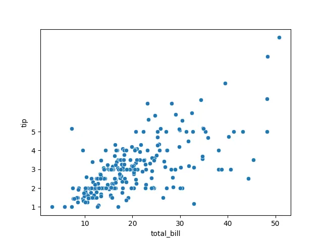
In this example, we first create a scatter plot using the tips dataset. By calling plt.gca(), we get the current axes and then use set_xticks() and set_yticks() to specify the positions of the ticks. This approach gives you full control over where the ticks appear, allowing for a tailored visualization that highlights the most important data points.
Method 2: Using set_xticklabels() and set_yticklabels()
Once you have set the tick positions, you may want to customize the tick labels to make them more descriptive or relevant to your data. This is where the set_xticklabels() and set_yticklabels() functions come into play. With these functions, you can set custom labels for your ticks.
Here’s how you can do this:
import seaborn as sns
import matplotlib.pyplot as plt

# Sample data
tips = sns.load_dataset("tips")

# Create a basic scatter plot
sns.scatterplot(data=tips, x="total_bill", y="tip")

# Set custom ticks
plt.gca().set_xticks([10, 20, 30, 40, 50])
plt.gca().set_yticks([1, 2, 3, 4, 5])

# Set custom tick labels
plt.gca().set_xticklabels(['Ten', 'Twenty', 'Thirty', 'Forty', 'Fifty'])
plt.gca().set_yticklabels(['One', 'Two', 'Three', 'Four', 'Five'])

plt.show()
Output:
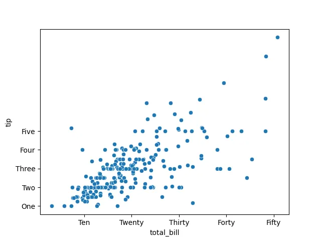
In this example, after setting the tick positions, we use set_xticklabels() and set_yticklabels() to provide custom labels for each tick. This method allows you to enhance the readability of your plots, making it easier for your audience to understand the data being presented. Custom tick labels can be particularly useful when dealing with categorical data or when you want to provide more context to numerical values.
Method 3: Using plt.xticks() and plt.yticks()
Another way to set axis ticks in Seaborn plots is by using the plt.xticks() and plt.yticks() functions from Matplotlib. These functions not only allow you to specify tick positions but also provide an option to set the corresponding tick labels in a single call.
Here’s an example:
import seaborn as sns
import matplotlib.pyplot as plt

# Sample data
tips = sns.load_dataset("tips")

# Create a basic scatter plot
sns.scatterplot(data=tips, x="total_bill", y="tip")

# Set custom ticks and labels
plt.xticks([10, 20, 30, 40, 50], ['Ten', 'Twenty', 'Thirty', 'Forty', 'Fifty'])
plt.yticks([1, 2, 3, 4, 5], ['One', 'Two', 'Three', 'Four', 'Five'])

plt.show()
Output:

In this method, we achieve the same outcome as before, but with a more concise syntax. The plt.xticks() and plt.yticks() functions allow you to set both the tick positions and their labels in one go, making your code cleaner and easier to read. This method is particularly useful for quick customizations or when you want to keep your code succinct.
Conclusion
Customizing axis ticks in Seaborn plots is a straightforward yet powerful way to enhance your data visualizations. By using methods like set_xticks(), set_yticks(), set_xticklabels(), set_yticklabels(), plt.xticks(), and plt.yticks(), you can tailor your plots to convey the right message effectively. Whether you’re presenting data to colleagues or sharing insights with a broader audience, clear and meaningful axis ticks can significantly improve the readability of your visualizations. So, don’t hesitate to experiment with these techniques in your next Seaborn project!
FAQ
-
What are axis ticks in Seaborn plots?
Axis ticks are the markers on the axes of a plot that indicate the scale of the data being represented. -
Can I change the orientation of the tick labels?
Yes, you can change the orientation of tick labels using therotationparameter in theset_xticklabels()andset_yticklabels()functions. -
Is it possible to format the tick labels?
Absolutely! You can format tick labels using string formatting methods or by providing a list of formatted strings. -
How do I set the frequency of ticks?
You can set the frequency of ticks by specifying the positions inset_xticks()orset_yticks()based on the range of your data. -
Can I use different styles for the tick labels?
Yes, you can customize the font size, weight, and color of the tick labels using thefontsize,fontweight, andcolorparameters in theset_xticklabels()andset_yticklabels()functions.

Manav is a IT Professional who has a lot of experience as a core developer in many live projects. He is an avid learner who enjoys learning new things and sharing his findings whenever possible.
LinkedIn