How to Add Axis Labels to Seaborn Plot
-
Method 1: Using the
set_xlabelandset_ylabelMethods -
Method 2: Using the
xlabelandylabelFunctions from Matplotlib - Conclusion
- FAQ

Seaborn is a powerful visualization library in Python that allows data scientists and analysts to create beautiful and informative graphics with ease. However, one common challenge is ensuring that your plots convey the right information through clear axis labels.
In this tutorial, we’ll explore how to add axis labels to your Seaborn plots effectively. Whether you’re working on a simple scatter plot or a complex heatmap, having well-defined labels can enhance the readability of your visualizations and ensure that your audience understands the data being presented. Let’s dive into the methods you can use to add these crucial elements to your Seaborn plots.
Method 1: Using the set_xlabel and set_ylabel Methods
One of the simplest ways to add axis labels in Seaborn is by using the set_xlabel and set_ylabel methods available in the Axes object. This approach allows you to directly set the labels after creating your plot.
import seaborn as sns
import matplotlib.pyplot as plt

# Load an example dataset
tips = sns.load_dataset("tips")

# Create a scatter plot
ax = sns.scatterplot(x='total_bill', y='tip', data=tips)

# Set axis labels
ax.set_xlabel("Total Bill ($)")
ax.set_ylabel("Tip ($)")

plt.show()
Output:
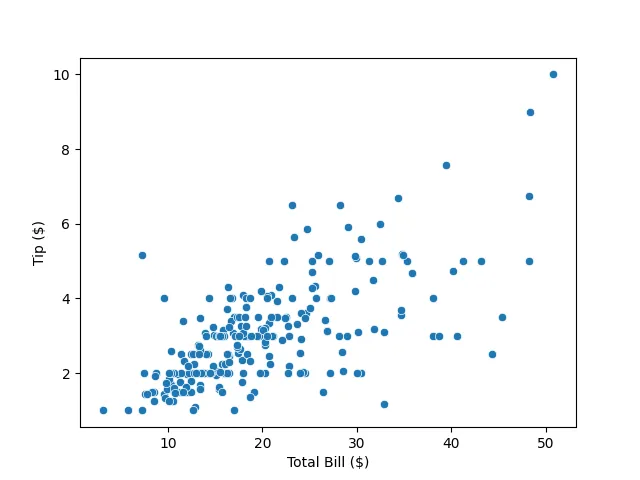
In this method, we first import the necessary libraries and load the dataset. After creating a scatter plot, we access the Axes object and use set_xlabel and set_ylabel to specify our labels. This method is straightforward and allows you to customize the labels to fit your specific needs. You can also modify the font size and style by passing additional parameters to the methods. This flexibility is particularly useful when you want to maintain consistency across multiple plots or tailor the appearance for presentations or publications.
Method 2: Using the xlabel and ylabel Functions from Matplotlib
Another effective way to add axis labels is by utilizing the xlabel and ylabel functions from Matplotlib. This method is particularly useful when you want to set labels before or after creating the plot without directly modifying the Axes object.
import seaborn as sns
import matplotlib.pyplot as plt

# Load an example dataset
penguins = sns.load_dataset("penguins")

# Create a box plot
sns.boxplot(x='species', y='flipper_length_mm', data=penguins)

# Set axis labels
plt.xlabel("Species")
plt.ylabel("Flipper Length (mm)")

plt.show()
Output:
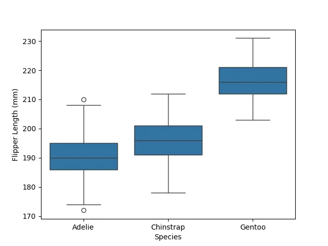
In this example, we create a box plot to visualize the flipper lengths of different penguin species. After plotting, we call plt.xlabel and plt.ylabel to set our desired labels. This method is beneficial when you have multiple plots in a single figure or when you prefer to keep your plotting code separate from the labeling logic. Additionally, you can customize your labels with various formatting options, making this method versatile for different visualization styles.
Conclusion
Adding axis labels to your Seaborn plots is essential for enhancing the clarity and effectiveness of your visualizations. Whether you choose to use the set_xlabel and set_ylabel methods, the xlabel and ylabel functions from Matplotlib. By implementing these techniques, you can ensure that your audience fully understands the data you are presenting. Remember, clear and concise labels can make all the difference in how your visualizations are interpreted. Happy plotting!
FAQ
-
How do I change the font size of axis labels in Seaborn?
You can change the font size by passing thefontsizeparameter to theset_xlabelandset_ylabelmethods. -
Can I add a title to my Seaborn plot?
Yes, you can use theplt.title()function to add a title to your plot. -
Is it possible to customize the color of the axis labels?
Absolutely! You can use theset_xlabelandset_ylabelmethods with thecolorparameter to customize the color of your axis labels. -
What should I do if my labels overlap?
If your labels overlap, consider rotating them using therotationparameter or adjusting the figure size usingplt.figure(figsize=(width, height)). -
Can I add grid lines to my Seaborn plot?
Yes, you can useplt.grid(True)to add grid lines to your plot for better readability.

Manav is a IT Professional who has a lot of experience as a core developer in many live projects. He is an avid learner who enjoys learning new things and sharing his findings whenever possible.
LinkedIn