How to Control Transparency of Seaborn Plots
- Understanding Transparency in Seaborn
- Method 1: Adjusting Transparency in Scatter Plots
- Method 2: Controlling Transparency in Bar Plots
- Method 3: Modifying Transparency in KDE Plots
- Conclusion
- FAQ

Visualizing data effectively is crucial in data analysis, and Seaborn, a powerful Python library built on top of Matplotlib, offers a variety of options for creating stunning plots. One of the key features that can enhance your visualizations is the control of transparency. Transparency, or alpha blending, allows you to overlay multiple plots without losing clarity, making your visualizations more informative.
In this tutorial, we will explore how to control the transparency of Seaborn plots using Python. Whether you are a beginner or an experienced data scientist, understanding how to adjust transparency can significantly improve your data presentation skills.
Understanding Transparency in Seaborn
Transparency in Seaborn plots is controlled using the alpha parameter. This parameter takes values between 0 and 1, where 0 is completely transparent and 1 is fully opaque. By adjusting the alpha value, you can create plots that allow for better visibility of overlapping data points or distributions. This is especially useful when dealing with large datasets or when you want to visualize multiple layers of information.
Method 1: Adjusting Transparency in Scatter Plots
Scatter plots are a great way to visualize relationships between two variables. By using the alpha parameter in Seaborn’s scatterplot() function, you can easily adjust the transparency of the points in your plot.
Here’s a simple example:
import seaborn as sns
import matplotlib.pyplot as plt

# Load an example dataset
tips = sns.load_dataset("tips")

# Create a scatter plot with transparency
sns.scatterplot(data=tips, x="total_bill", y="tip", alpha=0.5)

plt.title("Scatter Plot with Transparency")
plt.show()
Output:
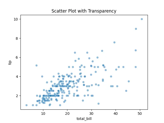
In this code, we first import the necessary libraries and load the tips dataset, which contains information about restaurant bills and tips. The scatterplot() function is then called with the alpha parameter set to 0.5, making the points semi-transparent. This allows overlapping points to be more visible, giving you a clearer picture of the data distribution.
By adjusting the alpha value, you can experiment with different levels of transparency to find the best fit for your data visualization needs.
Method 2: Controlling Transparency in Bar Plots
Bar plots are another popular way to visualize categorical data. Similar to scatter plots, you can control the transparency of bars in a bar plot using the alpha parameter in Seaborn’s barplot() function.
Consider the following example:
# Create a bar plot with transparency
sns.barplot(data=tips, x="day", y="total_bill", alpha=0.7)

plt.title("Bar Plot with Transparency")
plt.show()
Output:
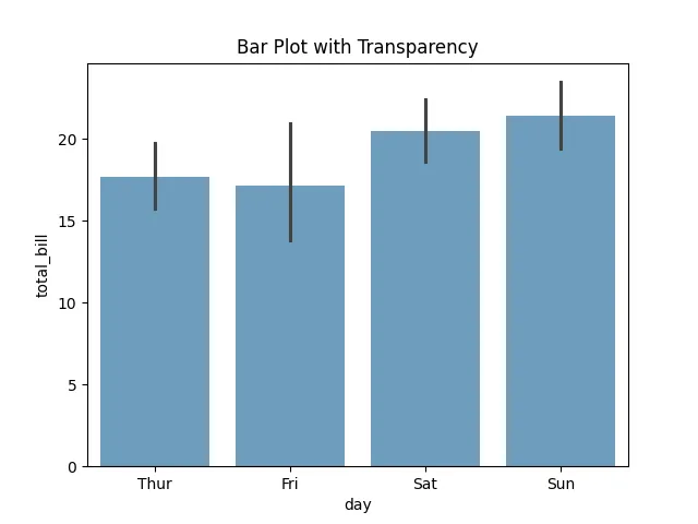
In this example, we create a bar plot to visualize the average total bill for each day of the week. The alpha parameter is set to 0.7, which makes the bars slightly transparent. This can be particularly useful when you want to overlay multiple bar plots for comparison, allowing viewers to see both sets of data without one overshadowing the other.
Using transparency effectively in bar plots can enhance your visual storytelling, making it easier for your audience to interpret the data.
Method 3: Modifying Transparency in KDE Plots
Kernel Density Estimate (KDE) plots are excellent for visualizing the distribution of a dataset. You can control the transparency of the KDE curves using the alpha parameter in Seaborn’s kdeplot() function. This is particularly useful when overlaying multiple KDE plots for different categories.
Here’s how you can do it:
# Create KDE plots with transparency
sns.kdeplot(data=tips[tips['sex'] == 'Male']['total_bill'], alpha=0.5, label='Male')
sns.kdeplot(data=tips[tips['sex'] == 'Female']['total_bill'], alpha=0.5, label='Female')

plt.title("KDE Plot with Transparency")
plt.legend()
plt.show()
Output:
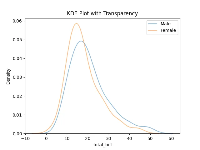
In this example, we create two KDE plots, one for male customers and another for female customers, using the kdeplot() function. By setting the alpha parameter to 0.5 for both plots, we allow the curves to overlap while still being distinguishable. This transparency makes it easier to compare the distributions of total bills between the two genders, enhancing the overall interpretability of the plot.
Conclusion
Controlling transparency in Seaborn plots is a powerful technique that can significantly improve your data visualizations. By adjusting the alpha parameter in various plot types—scatter plots, bar plots, and KDE plots—you can create layered visualizations that allow for better clarity and understanding of your data. Whether you’re presenting complex datasets or simply trying to make your visualizations more aesthetically pleasing, mastering transparency is an invaluable skill in your data visualization toolkit.
Incorporate these techniques into your projects and watch your data storytelling skills soar!
FAQ
-
How do I install Seaborn?
You can install Seaborn using pip with the commandpip install seaborn. -
What is the range of the alpha parameter?
The alpha parameter ranges from 0 (completely transparent) to 1 (fully opaque). -
Can I use transparency in other plot types?
Yes, you can use the alpha parameter in various Seaborn plot types, including scatter plots, bar plots, and KDE plots. -
What are some benefits of using transparency in plots?
Transparency helps to visualize overlapping data points, making it easier to interpret complex datasets. -
Is there a way to set transparency for all plots globally?
Yes, you can set a default transparency level for all plots using thesns.set()function with thestyleparameter.

Manav is a IT Professional who has a lot of experience as a core developer in many live projects. He is an avid learner who enjoys learning new things and sharing his findings whenever possible.
LinkedIn