How to Create Seaborn Line Plots
- Getting Started with Seaborn
- Creating a Basic Line Plot
- Customizing Line Plots
- Adding Confidence Intervals
- Plotting Multiple Lines
- Conclusion
- FAQ
Creating visualizations is a crucial part of data analysis, and line plots are among the most effective ways to visualize trends over time or continuous data. Seaborn, a powerful Python visualization library based on Matplotlib, makes it easy to generate beautiful line plots with just a few lines of code.
In this tutorial, we will explore how to create line plots using the Seaborn module, starting from the basics and moving to more advanced techniques. By the end, you will have a solid understanding of how to leverage Seaborn for your data visualization needs, enabling you to present your data in a clear and insightful manner.
Getting Started with Seaborn
Before diving into creating line plots, it’s essential to ensure you have Seaborn installed in your Python environment. If you haven’t installed it yet, you can do so using pip. Open your terminal and run the following command:
pip install seaborn
Once you have Seaborn installed, you can start by importing the necessary libraries. Typically, you will want to import Seaborn as well as Matplotlib for displaying your plots. Here’s how you can do that:
import seaborn as sns
import matplotlib.pyplot as plt
With these libraries imported, you’re ready to create your first line plot. Seaborn works well with pandas DataFrames, so if you have your data in that format, you’ll find it particularly easy to plot.
Creating a Basic Line Plot
To create a basic line plot, you can use the lineplot function from Seaborn. This function takes in various parameters, including the data source, the x-axis variable, and the y-axis variable. Here’s a simple example using random data:
import pandas as pd
import numpy as np

# Create sample data
data = pd.DataFrame({
    'x': np.arange(1, 11),
    'y': np.random.randint(1, 20, size=10)
})

# Create a line plot
sns.lineplot(x='x', y='y', data=data)
plt.title('Basic Line Plot')
plt.show()
In this example, we created a DataFrame with two columns: x and y. The x column contains values from 1 to 10, while the y column contains random integers. The lineplot function then generates a line plot, with the x-axis representing the values from x and the y-axis representing the values from y. The plt.show() function displays the plot.
This simple method allows you to visualize how y changes with x, making it a great starting point for exploring your data.
Customizing Line Plots
One of the strengths of Seaborn is its ability to customize plots easily. You can change the color, style, and markers of the lines to make your plots more informative and visually appealing. Here’s how you can customize a line plot:
# Create a customized line plot
sns.lineplot(x='x', y='y', data=data, color='red', marker='o', linestyle='--')
plt.title('Customized Line Plot')
plt.show()
Output:
A line plot with red dashed lines and circular markers at each data point.
In this example, we added several parameters to the lineplot function. The color parameter sets the line color to red, the marker parameter specifies that we want circular markers at each data point, and the linestyle parameter changes the line to a dashed style. Customizing your plots can help highlight important trends and make your visualizations more engaging.
Adding Confidence Intervals
Seaborn automatically includes a confidence interval in line plots, which provides a visual representation of the uncertainty around the estimated mean. You can adjust the confidence level or disable it altogether. Here’s how to do that:
# Create a line plot with confidence intervals
sns.lineplot(x='x', y='y', data=data, ci='sd')  # ci='sd' for standard deviation
plt.title('Line Plot with Confidence Intervals')
plt.show()
In this code, we specified ci='sd', which indicates that we want to show the standard deviation as the confidence interval. This feature is particularly useful when you want to understand the variability of your data. By visualizing these intervals, you can better interpret the results and make informed decisions based on your analysis.
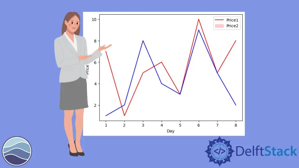
Plotting Multiple Lines
Seaborn also allows you to plot multiple lines on the same graph, which is helpful for comparing different datasets. You can achieve this by adding a hue parameter to differentiate between the lines. Here’s an example:
# Create sample data for multiple lines
data_multi = pd.DataFrame({
    'x': np.tile(np.arange(1, 11), 2),
    'y': np.random.randint(1, 20, size=20),
    'category': ['A'] * 10 + ['B'] * 10
})

# Create a line plot with multiple lines
sns.lineplot(x='x', y='y', hue='category', data=data_multi)
plt.title('Multiple Lines Line Plot')
plt.show()
Output:
A line plot with two lines, each representing a different category.
In this example, we created a DataFrame with an additional category column to indicate which line corresponds to which dataset. By using the hue parameter, Seaborn automatically assigns different colors to each line based on the categories. This allows for easy comparison of trends between different datasets, making it a powerful tool for analysis.
Conclusion
Creating line plots with Seaborn in Python is straightforward and highly customizable. By exploring the various options available, you can create informative and visually appealing plots that enhance your data analysis. Whether you’re working with simple datasets or complex ones, Seaborn provides the tools you need to effectively visualize trends and insights. With the knowledge gained from this tutorial, you are well-equipped to start creating your own line plots and elevating your data visualization skills.
FAQ
-
What is Seaborn?
Seaborn is a Python data visualization library based on Matplotlib that provides a high-level interface for drawing attractive and informative statistical graphics. -
Can I use Seaborn with Pandas DataFrames?
Yes, Seaborn works seamlessly with Pandas DataFrames, making it easy to visualize data stored in this format.
-
How do I customize the appearance of my line plots in Seaborn?
You can customize line plots in Seaborn by adjusting parameters such as color, marker, and linestyle directly in thelineplotfunction. -
What are confidence intervals, and how can I add them to my plots?
Confidence intervals provide a range of values that likely contain the true mean of the data. You can add them to your plots by using theciparameter in thelineplotfunction. -
Can I plot multiple lines on the same graph using Seaborn?
Yes, you can plot multiple lines by using thehueparameter to differentiate between categories in your dataset.

Manav is a IT Professional who has a lot of experience as a core developer in many live projects. He is an avid learner who enjoys learning new things and sharing his findings whenever possible.
LinkedIn