How to Create Seaborn Joint Plot
- Understanding the Joint Plot
- Creating a Basic Joint Plot
- Customizing the Joint Plot
- Adding Marginal Histograms
- Conclusion
- FAQ
Creating visualizations is a crucial part of data analysis, and Seaborn makes it incredibly easy to visualize relationships between variables. One of the most effective ways to explore the relationship between two continuous variables is through a joint plot. The jointplot() function in Seaborn provides a powerful way to visualize both the distribution of each variable and their relationship in a single figure.
In this article, we will delve into how to create a Seaborn joint plot step-by-step, offering clear examples and explanations to help you understand the process. Whether you’re a data scientist, analyst, or just someone interested in data visualization, this guide will equip you with the knowledge you need to create stunning joint plots using Python.
Understanding the Joint Plot
Before diving into the code, let’s take a moment to understand what a joint plot is. A joint plot is a combination of scatter plots and histograms. It visually represents the relationship between two variables while also displaying their individual distributions. This dual perspective allows for a more comprehensive understanding of how the variables interact with each other.
In Seaborn, the jointplot() function is versatile and allows you to customize the type of plot you want to create. You can choose between different kinds of visualizations, such as scatter plots, hexbin plots, and kernel density estimates. Let’s explore how to create a basic joint plot using Python.
Creating a Basic Joint Plot
To create a basic joint plot, you need to have Seaborn and Matplotlib libraries installed in your Python environment. If you haven’t installed them yet, you can do so using pip. Here’s how to create a simple joint plot:
import seaborn as sns
import matplotlib.pyplot as plt
import pandas as pd

# Sample dataset
data = pd.DataFrame({
    'X': [1, 2, 3, 4, 5, 6, 7, 8, 9, 10],
    'Y': [2, 3, 5, 7, 11, 13, 17, 19, 23, 29]
})

# Create a joint plot
sns.jointplot(x='X', y='Y', data=data)

plt.show()
Output:
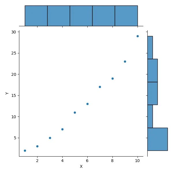
In this code, we first import the necessary libraries: Seaborn for visualization, Matplotlib for plotting, and Pandas for data manipulation. We create a simple DataFrame with two variables, X and Y. The jointplot() function is then called to visualize the relationship between these two variables. The resulting plot will display scatter points representing the data points, along with histograms on the axes showing the distribution of each variable.
Creating a basic joint plot is straightforward. This plot provides a clear visual representation of the relationship between two variables, allowing you to observe patterns, trends, and outliers.
Customizing the Joint Plot
One of the most powerful features of Seaborn is the ability to customize your plots. You can modify various aspects of the joint plot, such as the kind of plot used, color palettes, and more. Here’s how to customize your joint plot:
# Customizing the joint plot
sns.jointplot(x='X', y='Y', data=data, kind='hex', color='purple')

plt.show()
Output:
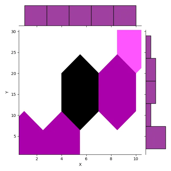
In this example, we changed the kind parameter to 'hex', which transforms the scatter plot into a hexbin plot. This can be particularly useful when dealing with larger datasets, as it helps visualize the density of data points in different areas of the plot. We also set the color parameter to 'purple' to give the plot a distinct look.
Customizing your joint plot allows you to tailor the visualization to better fit your data and presentation needs. You can experiment with different kinds of plots, colors, and additional parameters to create a visual that resonates with your audience.
Adding Marginal Histograms
While the joint plot already includes histograms on the axes, you can enhance your visualization by adding marginal histograms that provide more context. Here’s how to do that:
# Adding marginal histograms
sns.jointplot(x='X', y='Y', data=data, kind='scatter', marginal_kws=dict(bins=20, fill=True))

plt.show()
Output:
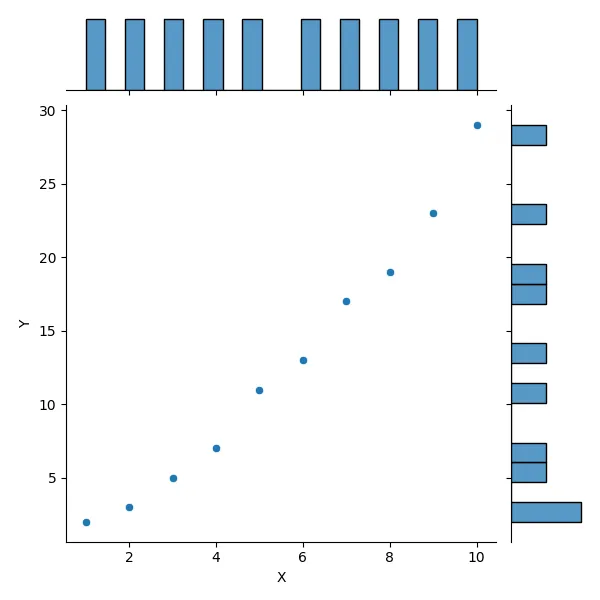
In this code, we specify marginal_kws to customize the bins and fill of the marginal histograms. By setting bins=20, we increase the number of bins in the histograms, allowing for a more detailed view of the distributions. The fill=True parameter fills the bars in the histogram, making them visually appealing.
Adding marginal histograms enriches the joint plot by providing additional information about the distribution of each variable. This can help identify skewness or other distributional characteristics that may be relevant for deeper analysis.
Conclusion
Creating a joint plot using Seaborn is a powerful way to visualize the relationship between two continuous variables. With just a few lines of code, you can produce informative and visually appealing plots that reveal insights into your data. Whether you’re using basic scatter plots or customizing with hexbin plots and marginal histograms, Seaborn’s jointplot() function offers flexibility and ease of use. As you continue to explore data visualization, remember that the right plot can make all the difference in communicating your findings effectively.
FAQ
-
what is a joint plot?
A joint plot is a visualization that combines scatter plots and histograms to show the relationship between two continuous variables and their individual distributions. -
how can I customize a joint plot in Seaborn?
You can customize a joint plot by changing parameters such as kind, color, and additional options for marginal histograms. -
can I use joint plots for large datasets?
Yes, joint plots can be very effective for large datasets, especially when using hexbin plots to visualize data density. -
what libraries do I need to create a joint plot?
You need to have Seaborn and Matplotlib libraries installed, along with Pandas for data manipulation. -
how do I interpret a joint plot?
A joint plot allows you to observe the relationship between two variables, identify trends, and analyze the distribution of each variable.
