How to Set Marker Size in Seaborn Scatterplots
-
Method 1: Using the
sParameter inscatterplot - Method 2: Adjusting Marker Size with a Variable
- Method 3: Customizing Marker Sizes with Additional Parameters
- Conclusion
- FAQ

Creating visually appealing scatterplots is essential for data visualization, especially when using Seaborn in Python. One of the key aspects of making your scatterplots effective is controlling the marker size.
This tutorial will guide you through the different methods to adjust marker sizes in Seaborn scatterplots, ensuring that your data is presented clearly and attractively. Whether you’re a beginner or an experienced user, understanding how to manipulate marker sizes can enhance your visual storytelling. Let’s dive into the methods that will help you create stunning scatterplots with the right marker sizes.
Method 1: Using the s Parameter in scatterplot
One of the simplest ways to set the marker size in Seaborn scatterplots is by using the s parameter within the scatterplot function. This parameter allows you to define a single size for all markers or pass an array-like structure to control the size dynamically based on another variable.
Here’s how you can implement this:
import seaborn as sns
import matplotlib.pyplot as plt

# Load an example dataset
data = sns.load_dataset("tips")

# Create a scatterplot with a fixed marker size
sns.scatterplot(data=data, x="total_bill", y="tip", s=100)

plt.title("Scatterplot with Fixed Marker Size")
plt.show()
Output:
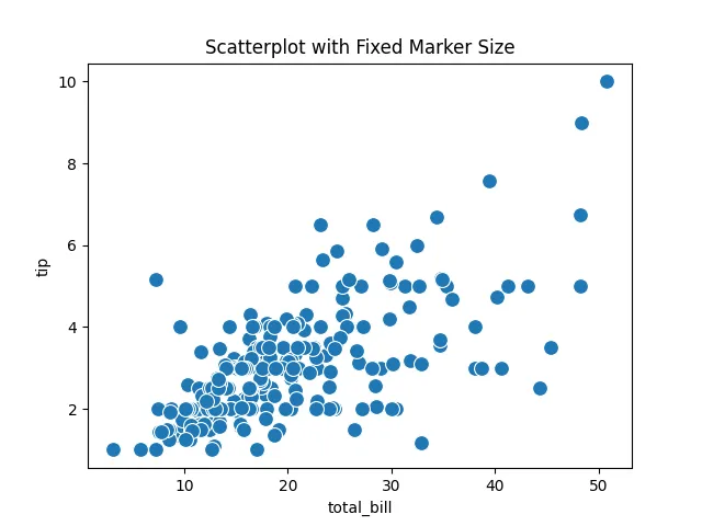
In this example, we load the “tips” dataset and create a scatterplot where the s parameter is set to 100. This means all markers will have the same size, making it easy to visualize the relationship between total bills and tips. If you want to create a more dynamic visualization, you can pass an array of sizes corresponding to each data point. For instance, if you want the size of each marker to represent the size of the party, you can do this:
sns.scatterplot(data=data, x="total_bill", y="tip", s=data['size'] * 10)
This flexibility allows you to convey additional dimensions of your data visually, enhancing the overall interpretability of your scatterplot.
Method 2: Adjusting Marker Size with a Variable
If you want to represent a variable through marker size, you can pass a column from your dataset to the s parameter. This method provides a more nuanced view of your data, allowing viewers to quickly grasp trends and patterns.
Here’s how to implement this:
import seaborn as sns
import matplotlib.pyplot as plt

# Load the dataset
data = sns.load_dataset("tips")

# Create a scatterplot with variable marker sizes
sns.scatterplot(data=data, x="total_bill", y="tip", s=data['size'] * 30, hue="day")

plt.title("Scatterplot with Variable Marker Sizes")
plt.legend(title='Day')
plt.show()
Output:
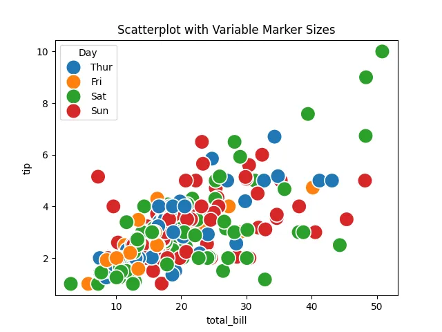
In this example, the s parameter is set to data['size'], meaning each marker’s size is proportional to the size of the party. Additionally, the hue parameter is used to color the markers based on the day of the week. This not only makes the plot more informative but also visually appealing. By adjusting the multiplier (in this case, 30), you can fine-tune the size representation to suit your visualization needs.
Method 3: Customizing Marker Sizes with Additional Parameters
Seaborn also allows you to further customize your scatterplots by using additional parameters such as style and palette. This can enhance the visual distinction between different groups in your data.
Here’s how you can incorporate these features:
import seaborn as sns
import matplotlib.pyplot as plt

# Load the dataset
data = sns.load_dataset("tips")

# Create a scatterplot with customized marker sizes and styles
sns.scatterplot(data=data, x="total_bill", y="tip", s=data['size'] * 20, hue="sex", style="time", palette="deep")

plt.title("Customized Scatterplot with Marker Sizes")
plt.legend(title='Gender and Time')
plt.show()
Output:
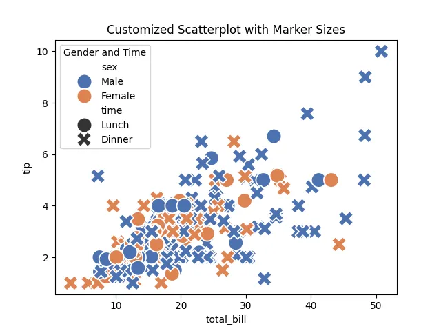
In this example, the hue parameter is set to “sex,” which colors the markers based on gender, while the style parameter differentiates between lunch and dinner times. By using a combination of these parameters, you create a scatterplot that is not only informative but also visually striking. This method allows viewers to quickly identify patterns and relationships within your data, making your analysis more effective.
Conclusion
Mastering how to set marker sizes in Seaborn scatterplots can significantly improve the clarity and impact of your visualizations. Whether you choose to use fixed sizes or variable sizes based on data attributes, the flexibility of Seaborn allows you to tailor your plots to your specific needs. By implementing the methods discussed in this tutorial, you can create scatterplots that effectively communicate your data’s story. Remember, the right visualizations can make all the difference in data analysis and presentation.
FAQ
-
How do I change the default marker size in Seaborn?
You can change the default marker size by using thesparameter in thescatterplotfunction. -
Can I use different sizes for different markers in a single scatterplot?
Yes, by passing an array of sizes to thesparameter, you can customize sizes for each marker. -
What is the purpose of the
hueparameter in scatterplots?
Thehueparameter allows you to color markers based on a categorical variable, helping to differentiate groups visually. -
How can I make my scatterplot more visually appealing?
You can enhance your scatterplot by adjusting colors, sizes, and styles, and by adding titles and legends for clarity. -
Is it possible to save my Seaborn scatterplot as an image?
Yes, you can save your plot usingplt.savefig('filename.png')before callingplt.show().

Manav is a IT Professional who has a lot of experience as a core developer in many live projects. He is an avid learner who enjoys learning new things and sharing his findings whenever possible.
LinkedIn