How to Reverse Log Scale in Seaborn Plots
Creating visually appealing and informative plots is essential for data analysis. In Python, Seaborn is a powerful library that simplifies the process of generating complex visualizations. One of the intriguing features of Seaborn is the ability to manipulate scales, including log scales.
In this tutorial, we will explore how to use log and reverse log scales in Seaborn plots. By the end, you’ll know how to effectively visualize your data, whether it follows a linear or exponential trend. Let’s dive into this exciting topic and unlock the full potential of Seaborn for your data visualization needs!
Logarithmic scales are particularly useful when dealing with data that spans several orders of magnitude. They can help in visualizing trends that might be difficult to discern on a linear scale. Seaborn allows you to easily implement log scales through its plotting functions. However, sometimes you may want to reverse the log scale to emphasize certain aspects of your data. This can be particularly useful in fields like finance, biology, and engineering, where exponential growth is common.
In Seaborn, you can achieve this by utilizing the set_scale() function along with the x or y axes. Let’s look at how to create a standard log scale plot first.
Creating a Log Scale Plot
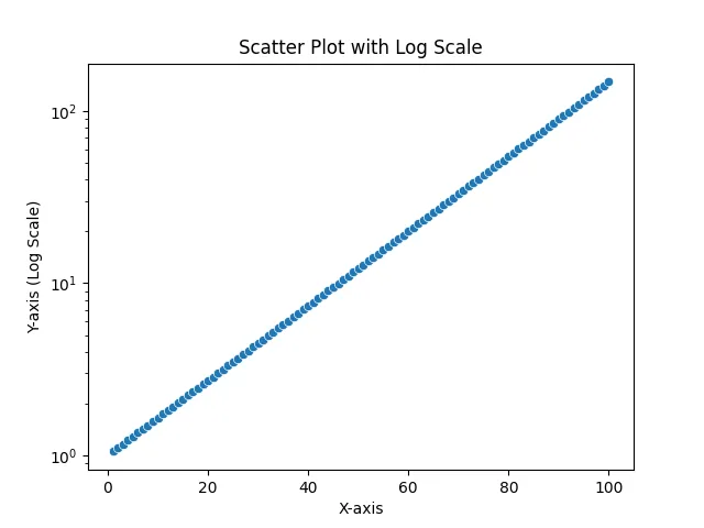
To create a log scale plot in Seaborn, you can use the scatterplot or lineplot functions. Below is an example that demonstrates how to create a simple scatter plot using log scale for the y-axis.
import seaborn as sns
import matplotlib.pyplot as plt
import numpy as np

# Generating some example data
x = np.linspace(1, 100, 100)
y = np.exp(x / 20)

# Creating a scatter plot with log scale
sns.scatterplot(x=x, y=y)
plt.yscale('log')
plt.title('Scatter Plot with Log Scale')
plt.xlabel('X-axis')
plt.ylabel('Y-axis (Log Scale)')
plt.show()
Output:
In this example, we first import the necessary libraries: Seaborn for plotting, Matplotlib for displaying the plot, and NumPy for generating data. We create an array of x values ranging from 1 to 100 and calculate the corresponding y values using an exponential function. By calling plt.yscale('log'), we convert the y-axis to a logarithmic scale. The result is a scatter plot that effectively illustrates the exponential growth of y as x increases.
Reversing the Log Scale
Now that we have a standard log scale plot, let’s explore how to reverse this scale. Reversing the log scale can provide a different perspective on your data, making it easier to interpret certain trends. To reverse the log scale in Seaborn, you can use the set_scale() function with the inverse option.
Here’s how to reverse the log scale in a Seaborn plot.
# Creating a scatter plot with reversed log scale
sns.scatterplot(x=x, y=y)
plt.yscale('log')
plt.gca().invert_yaxis()
plt.title('Scatter Plot with Reversed Log Scale')
plt.xlabel('X-axis')
plt.ylabel('Y-axis (Reversed Log Scale)')
plt.show()
Output:
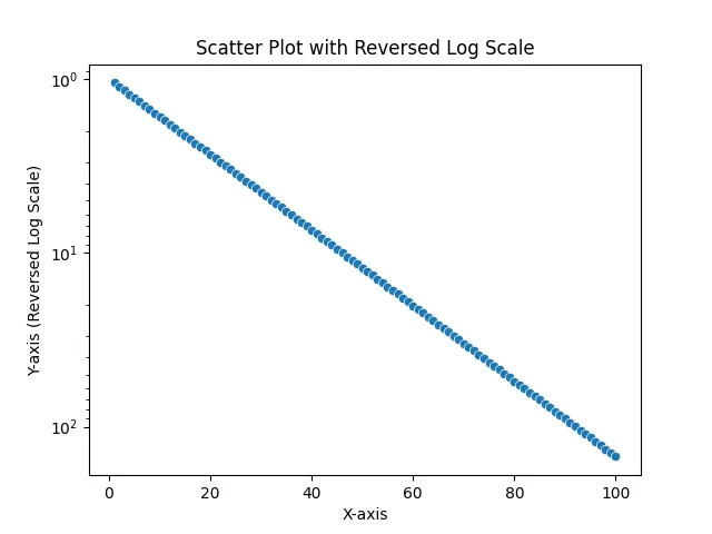
In this example, we use the same data as before. After setting the y-axis to a logarithmic scale, we call plt.gca().invert_yaxis() to reverse the y-axis. This gives us a new perspective on our data, allowing us to visualize how the values decrease as we move along the x-axis. This technique can be particularly useful when you want to highlight certain features of your data that may be less visible on a standard log scale.
Customizing Log Scale Plots
Customization is key to effective data visualization. In Seaborn, you have a range of options to modify your log scale plots, including changing colors, markers, and adding regression lines. Let’s look at how to customize a log scale plot with additional features.
# Customizing the scatter plot with log scale
sns.set(style="whitegrid")
plt.figure(figsize=(10, 6))
sns.scatterplot(x=x, y=y, color='blue', marker='o', s=100)
plt.yscale('log')
plt.title('Customized Scatter Plot with Log Scale')
plt.xlabel('X-axis')
plt.ylabel('Y-axis (Log Scale)')
plt.grid(True)
plt.show()
Output:
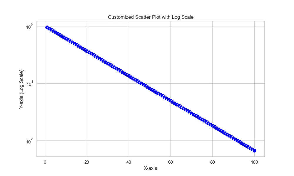
In this code, we set the style to “whitegrid” for better visibility. We also specify the figure size to ensure our plot is easy to read. The sns.scatterplot() function is enhanced with custom color and marker size options. Finally, we enable the grid for improved readability. Customizing your plots not only makes them more visually appealing but also helps convey your message more effectively.
Conclusion
In this tutorial, we explored how to use log and reverse log scales in Seaborn plots. We learned how to create standard log scale plots and how to reverse these scales for different perspectives on our data. By customizing our visualizations, we can enhance clarity and engagement. Whether you’re working with exponential growth data or simply looking to present your findings more effectively, mastering these techniques will elevate your data visualization skills. Happy plotting!
FAQ
-
What is a log scale?
A log scale is a type of scale used in graphs where each unit increase on the axis represents a tenfold increase in value, useful for visualizing data spanning multiple orders of magnitude. -
How do I create a log scale in Seaborn?
You can create a log scale in Seaborn by using theplt.yscale('log')orplt.xscale('log')functions after creating your plot. -
Why would I want to reverse a log scale?
Reversing a log scale can help emphasize certain trends or features of your data that may not be as clear on a standard log scale. -
Can I customize my Seaborn plots?
Yes, Seaborn offers a variety of customization options, including colors, markers, and grid lines, to enhance the visual appeal and clarity of your plots. -
Is it possible to combine log scales with other plot types in Seaborn?
Absolutely! You can combine log scales with various Seaborn plot types, such as line plots and bar plots, to best represent your data.

Manav is a IT Professional who has a lot of experience as a core developer in many live projects. He is an avid learner who enjoys learning new things and sharing his findings whenever possible.
LinkedIn