How to Use Catplot in Seaborn
- Creating Basic Categorical Plots
- Customizing the Appearance of Plots
- Adding Statistical Estimations
- Conclusion
- FAQ

If you’re delving into the world of data visualization in Python, you may have come across Seaborn, a powerful library that simplifies the creation of attractive statistical graphics. One of its standout features is the catplot() function, which allows you to create a variety of categorical plots easily. Whether you’re looking to visualize distributions, relationships, or comparisons among categories, catplot() has you covered.
This tutorial will guide you through the process of using the catplot() function, complete with practical examples and explanations. By the end, you’ll be equipped to enhance your data storytelling with compelling visualizations.
The catplot() function in Seaborn serves as a high-level interface for drawing categorical plots. It combines various types of plots, such as bar plots, box plots, and violin plots, into a single function. This versatility makes it an invaluable tool for data scientists and analysts who want to display relationships between categorical variables effectively.
Creating Basic Categorical Plots
To illustrate how to use catplot(), let’s begin with a basic example. We’ll utilize the built-in tips dataset, which contains information about restaurant tips, including total bill amounts, tips, and customer demographics.
Here’s how you can create a simple bar plot using catplot():
import pandas as pd
import matplotlib.pyplot as plt
import seaborn as sns
df = pd.DataFrame(
{
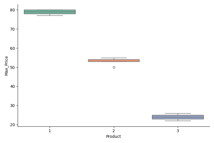
"Product": [1, 1, 2, 3, 1, 2, 2, 3, 3, 3, 3, 1, 2, 2, 1],
"Max_Price": [78, 79, 55, 26, 80, 54, 50, 24, 25, 22, 23, 80, 53, 54, 77],
}
)
sns.catplot(data=df, x="Product", y="Max_Price", kind="strip")
plt.show()
In this code, we first import the necessary libraries and create a Pandas dataframe. The catplot() function is then called with the parameters x='Product' and y='Max_Price', which specifies the categorical and numerical variables, respectively. The kind='bar' argument indicates that we want a bar plot. Finally, we display the plot using plt.show().
This simple example illustrates how easy it is to create a bar plot using Seaborn’s catplot(). The resulting visual clearly shows the average total bill for each day of the week, allowing for quick comparisons.
Customizing the Appearance of Plots
While the default settings of catplot() can produce visually appealing plots, customization can take your visualizations to the next level. You can modify various aspects of the plot, including colors, styles, and additional aesthetic parameters.
Here’s an example that demonstrates how to customize the appearance of a box plot:
sns.catplot(x='day', y='total_bill', data=tips, kind='box', palette='Set2', height=5, aspect=1.5)
plt.title('Total Bill Distribution by Day')
plt.show()
Output:
In this example, we again use the same dataframe, but this time we specify kind='box' to create a box plot. The palette='Set2' argument changes the color scheme, while height and aspect control the size and aspect ratio of the plot. These customizations enhance the clarity and aesthetics of the visualization, making it more engaging for viewers.
Customizing plots allows you to align them with your presentation style or brand, ensuring that your visualizations are not just informative but also visually appealing.
Adding Statistical Estimations
One of the key advantages of using Seaborn’s catplot() is its ability to incorporate statistical estimations directly into your plots. This feature can provide additional insights into your data, such as confidence intervals or error bars.
Here’s an example that demonstrates how to add a confidence interval to a bar plot:
sns.catplot(x='day', y='total_bill', data=tips, kind='bar', ci='sd')
plt.title('Average Total Bill by Day with Standard Deviation')
plt.show()
Output:
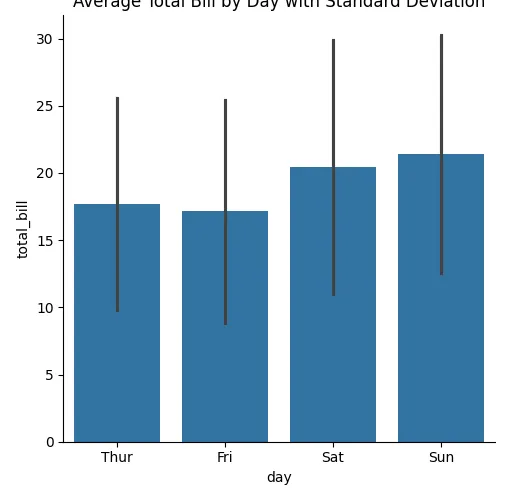
In this code, we use the ci='sd' parameter to add standard deviation error bars to the bar plot. This addition provides a visual representation of the variability of the total bills for each day, giving viewers a better understanding of the data’s distribution.
By including statistical estimations in your plots, you can convey more information and help your audience grasp the nuances of your data.
Conclusion
In this tutorial, we explored how to use the catplot() function in Seaborn to create various types of categorical plots. We covered the basics of creating plots, customizing their appearance, and adding statistical estimations to enhance your visualizations. By mastering catplot(), you can effectively communicate your data insights through compelling graphics. Whether you’re presenting to stakeholders or sharing your findings with a broader audience, Seaborn’s catplot() is a valuable tool in your data visualization toolkit.
FAQ
-
what is catplot in seaborn?
Catplot is a high-level interface in Seaborn for creating categorical plots, allowing users to visualize relationships between categorical variables effortlessly. -
how do I install seaborn?
You can install Seaborn using pip with the command: pip install seaborn. -
can I customize the appearance of my plots?
Yes, Seaborn allows extensive customization options, including colors, styles, and sizes, to tailor your plots to your needs. -
what types of plots can I create with catplot?
Catplot can create various types of plots, including bar plots, box plots, violin plots, and scatter plots, among others. -
how can I add statistical estimations to my plots?
You can add statistical estimations, such as confidence intervals or error bars, using theciparameter in thecatplot()function.

Manav is a IT Professional who has a lot of experience as a core developer in many live projects. He is an avid learner who enjoys learning new things and sharing his findings whenever possible.
LinkedIn