How to Set the Background Color of Seaborn Plots
-
Method 1: Using the
set_styleFunction - Method 2: Customizing with set_palette and set_context
- Method 3: Directly Setting the Figure Background Color
- Method 4: Using Axes-Level Functions
- Conclusion
- FAQ

Seaborn is a powerful visualization library in Python that allows data scientists and analysts to create stunning and informative plots with ease. One of the often-overlooked features of Seaborn is the ability to customize the background color of your plots. This can significantly enhance the visual appeal and clarity of your data visualizations.
In this tutorial, we will explore various methods to set the background color of Seaborn plots. Whether you want a clean white background or a dark theme, we’ve got you covered. Let’s dive in and learn how to make your Seaborn plots not only informative but also visually striking!
Method 1: Using the set_style Function
One of the simplest ways to change the background color of Seaborn plots is by using the set_style function. This function allows you to choose from several predefined styles, such as “white”, “dark”, “whitegrid”, “darkgrid”, and “ticks”. Each style comes with its own background color, grid lines, and other aesthetic features.
Here’s how to use the set_style function:
import random
import seaborn as sns
import matplotlib as plt

s_x = random.sample(range(0, 100), 20)
s_y = random.sample(range(0, 100), 20)

sns.set_style("darkgrid")
sns.scatterplot(y=s_y, x=s_x)

Using set_style is a straightforward method that allows you to quickly change the background color of your plots. In the example above, we set the style to darkgrid, which provides a dark background with grid lines. This can be particularly useful for emphasizing data points in your visualizations. You can experiment with different styles to find the one that best suits your data and audience.
Method 2: Customizing with set_palette and set_context
While set_style is great for predefined backgrounds, you might want more control over the colors used in your plots. You can achieve this by combining the set_palette and set_context functions with custom parameters. This allows you to tailor the aesthetics of your plots, including background colors, fonts, and other visual elements.
Here’s an example:
import seaborn as sns
import matplotlib.pyplot as plt

# Set the context and custom color palette
sns.set_context("notebook", font_scale=1.2)
sns.set_palette("pastel")

# Create a plot with a white background
sns.set_style("white")

data = sns.load_dataset("penguins")
sns.scatterplot(data=data, x="flipper_length_mm", y="body_mass_g")

plt.show()
Output:
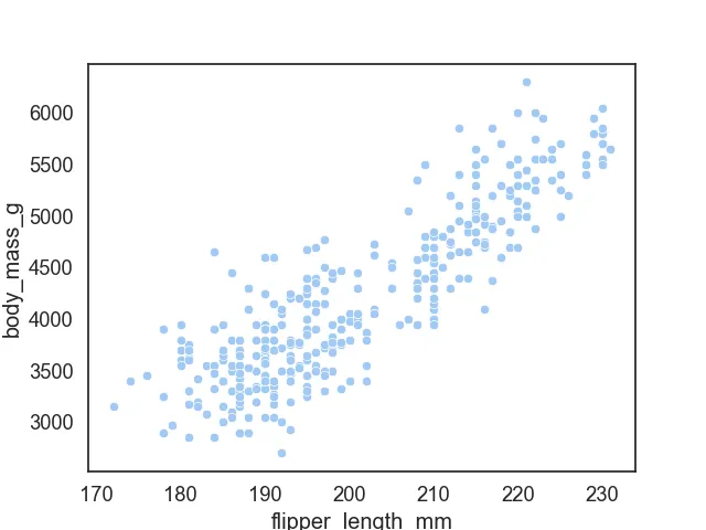
In this example, we first set the context to “notebook” and adjusted the font scale for better readability. Then, we chose a pastel color palette for a softer look. Finally, we set the style to “white” for a clean background. This method is particularly useful when you want to create a consistent look across multiple plots, making your visualizations more cohesive.
Method 3: Directly Setting the Figure Background Color
If you need even more control over your plot’s appearance, you can directly set the figure background color using Matplotlib’s figure method. This approach allows you to specify exact colors in RGB or hex format, giving you the freedom to create unique visual styles.
Here’s how to do it:
import seaborn as sns
import matplotlib.pyplot as plt

# Create a figure with a specific background color
plt.figure(facecolor='lightblue')

data = sns.load_dataset("iris")
sns.scatterplot(data=data, x="sepal_length", y="sepal_width")

plt.show()
Output:

In this example, we created a figure with a light blue background by specifying the facecolor parameter in the plt.figure() function. This method is particularly useful for creating themed plots or when you want your background color to match a specific design requirement. You can use any valid color name, hex code, or RGB tuple to achieve the desired effect.
Method 4: Using Axes-Level Functions
If you prefer to customize the background color of individual axes rather than the entire figure, you can use axes-level functions in Seaborn. This allows you to have different background colors for different plots within the same figure. It’s a great way to highlight specific data or create visual contrasts.
Here’s an example:
import seaborn as sns
import matplotlib.pyplot as plt

# Create a figure
fig, ax = plt.subplots()

# Set the background color of the axes
ax.set_facecolor('lightgreen')

data = sns.load_dataset("flights")
sns.lineplot(data=data, x="month", y="passengers", ax=ax)

plt.show()
Output:
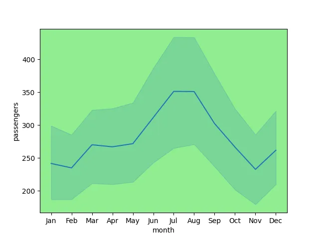
In this example, we set the background color of the axes to light green using the set_facecolor method. This allows for a more focused representation of the data, making it stand out against the specified background. This method is especially useful when comparing multiple datasets within the same figure, as it allows you to visually separate them.
Conclusion
Customizing the background color of Seaborn plots can greatly enhance your data visualizations. Whether you’re opting for a clean white background, a dark grid, or a unique color theme, Seaborn offers various methods to achieve your desired look. From using the set_style function to directly setting figure backgrounds, you can create plots that not only convey information but also captivate your audience. Experiment with these techniques to find the perfect aesthetic for your data storytelling!
FAQ
-
How can I change the background color of all my Seaborn plots at once?
You can use theset_stylefunction to set a global style for all plots in your session. -
What color formats can I use for background colors in Seaborn?
You can use color names, hex codes, or RGB tuples to define your background colors. -
Can I customize the background color of individual plots within the same figure?
Yes, you can set the background color of individual axes using theset_facecolormethod. -
Is it possible to save my customized plots with the background color?
Absolutely! You can save your plots usingplt.savefig()after customizing them.
- What are some best practices for choosing background colors in data visualizations?
Choose colors that enhance readability, avoid colors that clash with data points, and consider your audience’s preferences.

Manav is a IT Professional who has a lot of experience as a core developer in many live projects. He is an avid learner who enjoys learning new things and sharing his findings whenever possible.
LinkedIn