How to Add Title to Seaborn Plot
-
Method 1: Using the
set_title()Function -
Use the
set()Function to Add a Title to a Seaborn Plot -
Method 3: Using the
plt.title()Function - Method 3: Customizing Title Appearance
- Conclusion
- FAQ

Creating visually appealing plots is essential for data visualization in Python, and Seaborn is one of the most powerful libraries for this purpose. However, adding titles to your plots can sometimes be overlooked. A well-placed title not only provides context but also enhances the overall presentation of your data.
In this tutorial, we’ll walk you through the steps to add a title to Seaborn plots effectively. Whether you’re a beginner or an experienced user, this guide will help you understand how to incorporate titles seamlessly into your visualizations. Let’s dive in!
Method 1: Using the set_title() Function
One of the simplest ways to add a title to your Seaborn plots is by using the set_title() function. This method allows you to set the title directly on the axes object returned by Seaborn functions. Below is an example of how to implement this.
import pandas as pd
import matplotlib.pyplot as plt
import seaborn as sns

df = pd.DataFrame(
    {"Day 1": [7, 1, 5, 6, 3, 10, 5, 8], "Day 2": [1, 2, 8, 4, 3, 9, 5, 2]}
)

p = sns.lineplot(data=df)
p.set_title("Title")

plt.show()

In this example, we first import the necessary libraries and create a Pandas dataframe. We then create a line plot using the lineplot() function. The key step here is calling set_title() on the line plot object p. This method allows you to easily customize the title, which is crucial for providing context to your data visualization. After setting the title, we call plt.show() to display the plot. This method is straightforward and effective, making it a great choice for quick visualizations.
Use the set() Function to Add a Title to a Seaborn Plot
The set() function is used to add different elements to the plot and can be used to add the title. We use the title parameter and give it the desired name.
For example,
import pandas as pd
import matplotlib.pyplot as plt
import seaborn as sns

df = pd.DataFrame(
    {"Day 1": [7, 1, 5, 6, 3, 10, 5, 8], "Day 2": [1, 2, 8, 4, 3, 9, 5, 2]}
)

p = sns.lineplot(data=df)
p.set(title="Title")

Note that it works similar to the set_title() function discussed earlier.
Method 3: Using the plt.title() Function
Another approach to add a title to your Seaborn plots is by using the plt.title() function from Matplotlib. This method is flexible and can be used in conjunction with other Matplotlib functions. Here’s how you can do it.
import pandas as pd
import matplotlib.pyplot as plt
import seaborn as sns

df = pd.DataFrame(
    {"Day 1": [7, 1, 5, 6, 3, 10, 5, 8], "Day 2": [1, 2, 8, 4, 3, 9, 5, 2]}
)

p = sns.lineplot(data=df)
plt.title("Title")

In this example, we create a scatter plot without explicitly saving the plot object. Instead, we directly call plt.title() to set the title of the plot. This method is particularly useful when you want to quickly add a title without managing axes or plot objects. It works seamlessly with Seaborn plots since Seaborn is built on top of Matplotlib. Just like the previous method, we use plt.show() to render the plot. This approach is great for those who prefer a more straightforward syntax and want to keep their code concise.
Method 3: Customizing Title Appearance
Adding a title is just the beginning. Customizing its appearance can make your plot even more engaging. You can adjust the font size, color, and style using both set_title() and plt.title(). Let’s explore how to enhance the title’s aesthetics.
import seaborn as sns
import matplotlib.pyplot as plt

tips = sns.load_dataset("tips")
ax = sns.scatterplot(x="total_bill", y="tip", data=tips)
ax.set_title("Total Bill vs Tip", fontsize=16, color='blue', fontweight='bold')

plt.show()
Output:
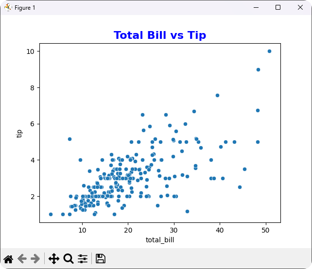
In this example, we use the set_title() method to not only set the title but also customize its appearance. The fontsize, color, and fontweight parameters allow for a more visually appealing title. This level of customization can be particularly useful when presenting your plots in reports or presentations. You can adjust these parameters to fit your style or branding, ensuring that your visualizations stand out. The flexibility of Seaborn combined with Matplotlib’s customization options makes it easy to create professional-looking plots.
Conclusion
Adding a title to your Seaborn plots is a simple yet effective way to enhance your data visualizations. Whether you choose to use set_title() or plt.title(), both methods provide you with the tools needed to make your plots informative and engaging. Additionally, customizing the appearance of your titles can further elevate your visualizations, making them more appealing to your audience. With these techniques in your toolkit, you’ll be well-equipped to create stunning visualizations that effectively communicate your data insights.
FAQ
-
How do I add a title to a Seaborn plot?
You can use theset_title()method on the axes object or theplt.title()function to add a title to your Seaborn plots. -
Can I customize the title font in Seaborn?
Yes, you can customize the title’s font size, color, and weight using parameters in bothset_title()andplt.title(). -
Is it necessary to use Matplotlib when working with Seaborn?
While Seaborn simplifies many aspects of data visualization, it is built on top of Matplotlib, so some Matplotlib functions may be necessary for certain customizations. -
What types of plots can I add titles to in Seaborn?
You can add titles to any Seaborn plot, including scatter plots, line plots, bar plots, and more. -
Can I add subtitles or annotations to Seaborn plots?
Yes, you can use Matplotlib functions to add subtitles or annotations to your Seaborn plots for additional context.

Manav is a IT Professional who has a lot of experience as a core developer in many live projects. He is an avid learner who enjoys learning new things and sharing his findings whenever possible.
LinkedIn