How to Create a ClusterMap in Seaborn
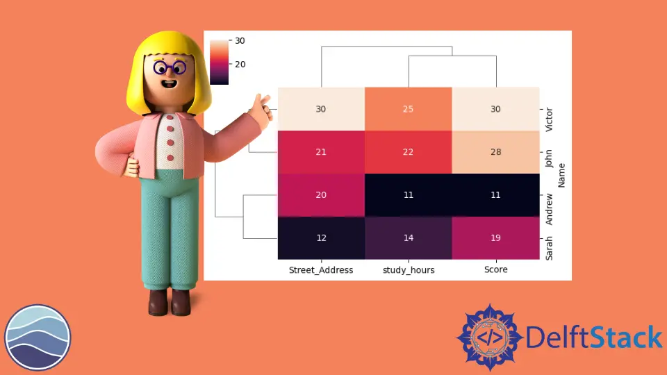
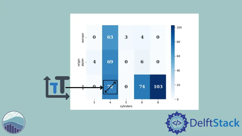
In this demonstration, we will learn what a cluster map is and how we can create and use it for multiple options. Create a Clustermap Using the clustermap() Method in Seaborn The seaborn cluster map is a matrix plot where you can visualize your matrix entities through a heat map, but we will also get a clustering of your rows and columns. Let’s import some required libraries. Code: import seaborn as sb import matplotlib.