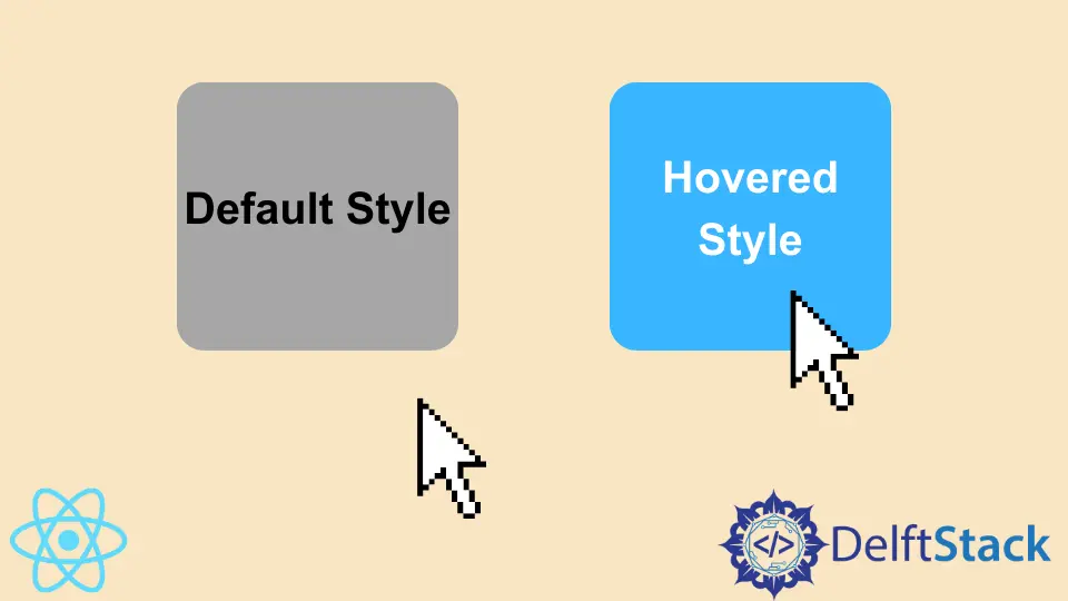
How to Style Hover in React

We will introduce multiple ways to style hover effects in React.
Use Hover Effects and Set Styles for Hover Effects in React
Hover effects are a great way to improve our web applications and make them user-friendly. These visual effects are great and help keep the users happy.
We can also use hover effects in our React applications to make them user-friendly and interesting with easy steps. Let’s start with an example to understand how we can use hover effects and set styles for our hover effects.
Let’s create a new application by using the following command.
# react
npx create-react-app my-app
After creating our new application in React, we will go to our application directory using this command.
# react
cd my-app
Now, let’s run our app to check if all dependencies are installed correctly.
# react
npm start
We must install a few libraries to help us implement hover effects in our application.
We will run the following command to install react-hook for hover.
# react
npm i @react-hook/hover
We will run the following command to install dash-ui/styles.
# react
npm i @dash-ui/styles
Once we have installed our libraries, we need to import useHover and styles in App.js file.
# react
import useHover from "@react-hook/hover";
import { styles } from "@dash-ui/styles";
Now, we will define our Hovertarget and Hovered elements inside export default function App(). And we will return a div which will change its class name once it is hovered and have a ref of Hovertarget, and it will output hovered style if someone hovers onto it or default style if no one is hovering on it.
# react
export default function App() {
  const Hovertarget = React.useRef(null);
  const Hovered = useHover(Hovertarget);
  return (
    <div className={hoverStyle({ Hovered })} ref={Hovertarget}>
      {Hovered ? "Hovered Style" : "Default Style"}
    </div>
  );
}
Now, we will define our CSS styles for Hovered and default classes. So our code in App.js will look like below.
# react
import React from "react";
import useHover from "@react-hook/hover";
import { styles } from "@dash-ui/styles";

export default function App() {
  const Hovertarget = React.useRef(null);
  const Hovered = useHover(Hovertarget);
  return (
    <div className={hoverStyle({ Hovered })} ref={Hovertarget}>
      {Hovered ? "Hovered Style" : "Default Style"}
    </div>
  );
}

const hoverStyle = styles({
  default: `
    background-color: lightblue;
    width: 100px;
    height: 100px;
    display: flex;
    justify-content: center;
    align-items: center;
  `,
  Hovered: `
    background-color: lightgreen;
    color: white;
  `
});
Output:

Now, try styling our hover effects using style.css instead of Instyle elements. First, we will create a new file as New.js, and inside it, we will return a div with a class New. We will also import style.css in this new file. So our code will look like below.
# react
import "./styles.css"

export default function New() {
  return <div className="New">CSS Style</div>;
}
Now we will import this new file in index.js to display on the main page in React and display the New component after the App component. Our code will look like below.
# react
import { StrictMode } from "react";
import ReactDOM from "react-dom";
import New from "./New.js";

import App from "./App";

const rootElement = document.getElementById("root");
ReactDOM.render(
  <StrictMode>
    <App />
    <New />
  </StrictMode>,
  rootElement
);
Now, let’s style our new div and hover effects using CSS.
# react
.New{
  background-color: lightgreen;
    width: 100px;
    height: 100px;
    display: flex;
    justify-content: center;
    align-items: center;
    margin-top: 10px;
}
.New:hover{
  background-color: lightblue;
    color: white;
}
Output:

Hover Output:

Rana is a computer science graduate passionate about helping people to build and diagnose scalable web application problems and problems developers face across the full-stack.
LinkedIn