pch in R
- What is pch in R?
- Basic Usage of pch
- Customizing pch Symbols
- Advanced Customization with pch
- Conclusion
- FAQ
When working with R for data visualization, one of the key aspects to master is the use of plotting characters, commonly referred to as pch. This parameter allows you to customize the appearance of points in your plots, making your visualizations not only informative but also aesthetically pleasing. Whether you’re a beginner or an experienced R user, understanding how to effectively use pch can significantly enhance your data presentation.
In this tutorial, we will delve into the various ways to utilize pch in R, showcasing examples that will help you grasp its functionality. By the end of this article, you’ll be equipped to elevate your plotting skills and create visually engaging graphics.
What is pch in R?
The pch parameter in R stands for “plotting character” and is used to specify the type of symbol that will be used to represent points in a plot. By default, R provides a range of symbols that you can choose from, including circles, squares, triangles, and more. Each symbol is represented by a numeric or character code, allowing for a high degree of customization.
Using pch effectively can help differentiate data points in a scatter plot, enhance clarity in line plots, and improve overall aesthetics. R’s flexibility in handling pch makes it a powerful tool for data visualization. In the following sections, we’ll explore how to implement pch in various plotting scenarios.
Basic Usage of pch
To get started, let’s see how to use pch in a simple scatter plot. Here, we will create a basic scatter plot using the built-in mtcars dataset.
plot(mtcars$wt, mtcars$mpg, pch=19, col='blue', main='Scatter Plot of MPG vs Weight', xlab='Weight', ylab='Miles Per Gallon')
In this example, pch=19 specifies that we want solid circles for our points. The col parameter sets the color of the points to blue, while main, xlab, and ylab provide titles and labels for the axes. This simple implementation already demonstrates how pch can enhance the clarity of your visualizations.
Customizing pch Symbols
R offers a variety of symbols to choose from, and you can even create your own. Let’s explore how to customize the pch symbols in a plot. In this example, we will use different pch values to represent different categories in the mtcars dataset.
plot(mtcars$wt, mtcars$mpg, pch=mtcars$cyl, col=mtcars$cyl, main='MPG vs Weight by Cylinder Count', xlab='Weight', ylab='Miles Per Gallon')
Output:
A scatter plot where different colors represent different cylinder counts.
Here, we use pch=mtcars$cyl, which assigns a unique symbol to each cylinder count in the dataset. The col parameter also reflects the cylinder count, creating a visually informative plot. This technique is particularly useful for distinguishing between categories in your data, making it easier for viewers to interpret your results.
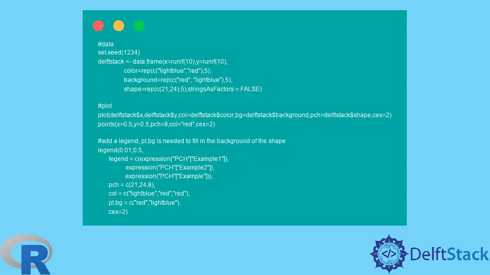
Advanced Customization with pch
For more advanced customization, you can combine multiple parameters to create a more complex visualization. Let’s add a legend to our previous plot to further clarify what each symbol represents.
plot(mtcars$wt, mtcars$mpg, pch=mtcars$cyl, col=mtcars$cyl, main='MPG vs Weight by Cylinder Count', xlab='Weight', ylab='Miles Per Gallon')
legend('topright', legend=unique(mtcars$cyl), pch=unique(mtcars$cyl), col=unique(mtcars$cyl), title='Cylinders')
Output:
A scatter plot with a legend indicating which symbols correspond to each cylinder count.
In this code, we added a legend function that places a legend in the top-right corner of the plot. The legend parameter specifies the unique cylinder counts, while pch and col ensure that the legend matches the symbols used in the plot. This makes your visualization not only more informative but also user-friendly.
Conclusion
Mastering the pch parameter in R is essential for anyone looking to enhance their data visualization skills. With the ability to customize point shapes and colors, you can create informative and visually appealing plots that effectively communicate your data insights. Whether you’re working with basic scatter plots or more complex visualizations, understanding how to leverage pch will undoubtedly improve your plotting capabilities. So, go ahead and experiment with different symbols and colors in your next R project!
FAQ
-
what is pch in R?
pch is a parameter in R that specifies the type of symbol used to represent points in a plot. -
how can I customize pch in my plots?
You can customize pch by using different numeric or character values to change the shape and appearance of the points. -
can I create my own pch symbols?
Yes, you can create custom symbols by using character codes or plotting your own shapes. -
what are some common pch values?
Common pch values include 1 for circles, 2 for triangles, and 19 for solid circles. -
how do I add a legend to my plot with pch?
You can add a legend using the legend() function, specifying the pch and col parameters to match the symbols in your plot.

Sheeraz is a Doctorate fellow in Computer Science at Northwestern Polytechnical University, Xian, China. He has 7 years of Software Development experience in AI, Web, Database, and Desktop technologies. He writes tutorials in Java, PHP, Python, GoLang, R, etc., to help beginners learn the field of Computer Science.
LinkedIn Facebook