How to Make the Legend of the Scatter Plot in Matplotlib
- Creating a Basic Scatter Plot
- Adding a Legend to the Scatter Plot
- Customizing the Legend
- Using Multiple Data Series in a Scatter Plot
- Conclusion
- FAQ
Creating effective visualizations is crucial in data analysis, and scatter plots are one of the most powerful tools in your arsenal. When using Matplotlib, a popular Python library, you can easily generate scatter plots that convey complex data relationships. However, a scatter plot without a legend can leave your audience confused about what each color or marker represents.
In this article, we will explore how to create a legend for your scatter plot using the matplotlib.pyplot.legend function. Not only will we walk through the process step-by-step, but we will also provide clear examples that you can easily replicate. Let’s dive into the world of Matplotlib and enhance your data visualizations with informative legends.
Before we jump into creating legends, it’s essential to understand what a scatter plot is and why it’s useful. A scatter plot displays values for typically two variables for a set of data. Each point on the plot represents an observation, allowing you to see patterns, trends, and correlations between the variables. For instance, you might plot the height and weight of individuals to see if there’s a correlation between these two variables.
In Matplotlib, you can create scatter plots using the scatter() function. Adding a legend helps identify different categories or groups within your data, making your visualizations more informative.
Creating a Basic Scatter Plot
Let’s start by generating a simple scatter plot. Here’s how you can do that in Python using Matplotlib.
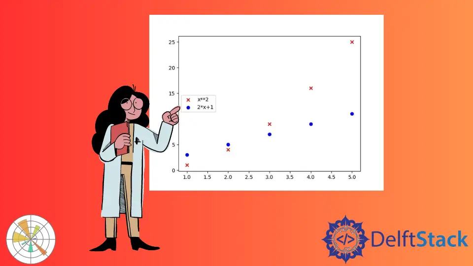
import numpy as np
import matplotlib.pyplot as plt

x = [1, 2, 3, 4, 5]

y1 = [i ** 2 for i in x]
y2 = [2 * i + 1 for i in x]

plt.scatter(x, y1, marker="x", color="r", label="x**2")
plt.scatter(x, y2, marker="o", color="b", label="2*x+1")
plt.show()
Output:
We have two separate scatter plots in the figure: one represented by x and another by the o mark. We assign the label to each scatter plot used as a tag while generating the legend.Finally we display the entire figure using the show() method.
While this plot is informative, it lacks a legend. Let’s add one to clarify what our data points represent.
Adding a Legend to the Scatter Plot
Now that we have our basic scatter plot, let’s add a legend to it. The legend will help viewers understand what the blue points signify.
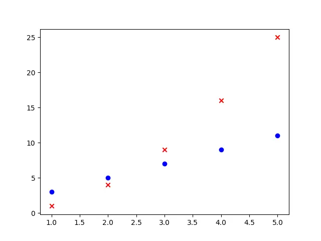
import numpy as np
import matplotlib.pyplot as plt

x = [1, 2, 3, 4, 5]

y1 = [i ** 2 for i in x]
y2 = [2 * i + 1 for i in x]

plt.scatter(x, y1, marker="x", color="r", label="x**2")
plt.scatter(x, y2, marker="o", color="b", label="2*x+1")
plt.legend()
plt.show()
Output:

In this updated code, we added the plt.legend() function before displaying the plot. This function automatically generates a legend based on the labels provided in the scatter() function. The legend is positioned in the best location by default, ensuring it doesn’t overlap with the data points.
Adding a legend is a simple yet effective way to enhance the clarity of your scatter plot. It allows your audience to quickly grasp the meaning behind the different colors or markers used.
Customizing the Legend
While the default legend is useful, you may want to customize its appearance to better fit your visualization. Matplotlib provides numerous options for styling your legend, including changing its location, font size, and background color.
import matplotlib.pyplot as plt

x = [1, 2, 3, 4, 5]
y = [2, 3, 5, 7, 11]
plt.scatter(x, y, color='blue', label='Prime Numbers')
plt.title('Customized Legend Scatter Plot')
plt.xlabel('X-axis')
plt.ylabel('Y-axis')
plt.legend(loc='upper left', fontsize='large', frameon=True, facecolor='white')
plt.show()
Output:
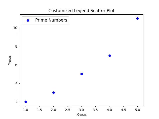
In this code, we’ve added several parameters to the plt.legend() function. The loc parameter specifies where the legend should appear, and in this case, we’ve chosen the upper left corner. The fontsize parameter adjusts the text size, making it easier to read. Additionally, the frameon and facecolor parameters allow you to customize the legend’s background color and frame appearance.
Customizing your legend not only enhances its visibility but also improves the overall aesthetic of your scatter plot.
Using Multiple Data Series in a Scatter Plot
In many cases, you may want to visualize multiple data series within the same scatter plot. This can be done by calling the scatter() function multiple times, each time with a different dataset and label.
import matplotlib.pyplot as plt

x1 = [1, 2, 3, 4, 5]
y1 = [2, 3, 5, 7, 11]
x2 = [1, 2, 3, 4, 5]
y2 = [1, 4, 6, 8, 10]

plt.scatter(x1, y1, color='blue', label='Prime Numbers')
plt.scatter(x2, y2, color='red', label='Even Numbers')
plt.title('Scatter Plot with Multiple Data Series')
plt.xlabel('X-axis')
plt.ylabel('Y-axis')
plt.legend()
plt.show()
Output:
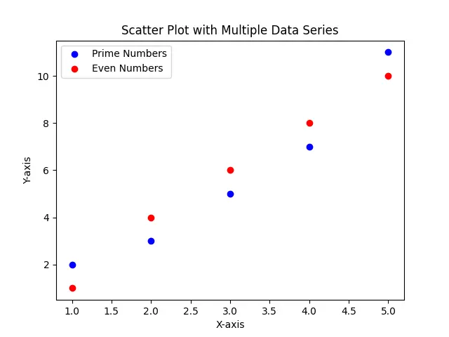
In this example, we define two sets of data points: one for prime numbers and another for even numbers. Each call to plt.scatter() includes a different color and label. By adding a single plt.legend() call at the end, we generate a legend that clearly distinguishes between the two datasets. This approach is effective for comparing different categories within the same plot, making your analysis more comprehensive.
Conclusion
Creating a legend for your scatter plot in Matplotlib is a straightforward process that significantly enhances your data visualization. By following the steps outlined in this article, you can easily add, customize, and manage legends, making your scatter plots more informative and visually appealing. Whether you’re presenting data in a report or sharing insights with colleagues, a well-constructed legend will ensure that your audience understands the key points of your analysis. So, go ahead and start incorporating legends into your scatter plots to improve clarity and engagement.
FAQ
-
How do I add a legend to my scatter plot in Matplotlib?
You can add a legend using theplt.legend()function after plotting your data points. -
Can I customize the legend in Matplotlib?
Yes, you can customize the legend’s location, font size, and background color using various parameters in theplt.legend()function. -
How do I create a scatter plot with multiple data series?
You can call theplt.scatter()function multiple times for different datasets and provide a label for each to distinguish them in the legend. -
What is the purpose of a legend in a scatter plot?
A legend helps viewers understand what different colors or markers represent in the scatter plot, making the visualization more informative. -
Is it necessary to include a legend in every scatter plot?
While not always necessary, including a legend is recommended when your scatter plot contains multiple data series or categories to avoid confusion.

Suraj Joshi is a backend software engineer at Matrice.ai.
LinkedInRelated Article - Matplotlib Scatter Plot
- How to Plot List of X,y Coordinates in Matplotlib
- How to Label Scatter Points in Matplotlib
- How to Plot Points in Matplotlib
- How to Set Color for Scatterplot in Matplotlib