Matplotlib Colorbar Range
-
Method 1: Using
vminandvmaxParameters -
Method 2: Using
Normalizefor Custom Scaling - Method 3: Customizing Colorbar Ticks and Labels
- Conclusion
- FAQ

When it comes to data visualization in Python, Matplotlib stands out as a powerful library. One of the key features that enhances the clarity of visual data representation is the colorbar. However, controlling the range of a colorbar can be a bit tricky, especially for those new to Matplotlib.
In this tutorial, we will explore how to effectively manage the colorbar range in your Matplotlib figures. Whether you’re visualizing heatmaps, scatter plots, or any other data representation, understanding how to adjust the colorbar range can significantly improve the interpretability of your visualizations. So, let’s dive in and unlock the secrets to mastering colorbars in Matplotlib.
A colorbar is a graphical representation of the data values that correspond to colors in your plot. It provides context to the colors used, helping viewers interpret the data more effectively. By default, Matplotlib will set the colorbar range based on the data you provide. However, there are instances where you may want to customize this range to enhance your visualizations.
Method 1: Using vmin and vmax Parameters
One of the simplest ways to control the colorbar range in Matplotlib is by using the vmin and vmax parameters when creating your plot. These parameters allow you to set the minimum and maximum values that the colorbar should represent. This method is particularly useful when you want to emphasize certain data ranges or when your data contains outliers.
Here’s how you can do it:
import numpy as np
import matplotlib.pyplot as plt

data = np.random.rand(10, 10) * 100

plt.imshow(data, vmin=20, vmax=80, cmap='viridis')
plt.colorbar()
plt.title('Colorbar with Custom Range')
plt.show()
Output:
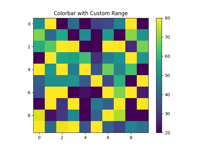
In this example, we generate a 10x10 array of random numbers scaled between 0 and 100. By setting vmin to 20 and vmax to 80, we restrict the colorbar to only reflect this range. Any values below 20 will be shown in the lowest color, while values above 80 will be shown in the highest color. This technique is effective for focusing on a specific range of interest, allowing viewers to interpret the data more easily.
Method 2: Using Normalize for Custom Scaling
Another powerful method for controlling the colorbar range is by utilizing the Normalize class from Matplotlib. This approach provides more flexibility, particularly when you want to apply custom scaling to your data. The Normalize class allows you to map your data values to the range of colors in the colormap.
Here’s an example of how to implement this:
import numpy as np
import matplotlib.pyplot as plt
from matplotlib.colors import Normalize

data = np.random.rand(10, 10) * 100
norm = Normalize(vmin=10, vmax=90)

plt.imshow(data, norm=norm, cmap='plasma')
plt.colorbar()
plt.title('Colorbar with Normalization')
plt.show()
Output:
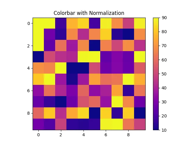
In this code snippet, we first create a Normalize object with specified vmin and vmax values. This normalization is then applied to the data when plotting. By doing so, we can effectively stretch or compress the colors to fit the specified range, providing a clearer visual representation of the data. This method is particularly useful when dealing with datasets that have a wide range of values or when you want to highlight specific parts of your data.
Method 3: Customizing Colorbar Ticks and Labels
Controlling the colorbar range also involves customizing the ticks and labels. This can enhance the readability of your colorbar and make it more informative. By default, Matplotlib automatically generates ticks based on the data range. However, you can customize these ticks to better suit your visualization needs.
Here’s how to do it:
data = np.random.rand(10, 10) * 100

plt.imshow(data, cmap='cividis')
cbar = plt.colorbar()
cbar.set_ticks([0, 25, 50, 75, 100])
cbar.set_ticklabels(['Low', 'Medium-Low', 'Medium', 'Medium-High', 'High'])
plt.title('Customized Colorbar Ticks and Labels')
plt.show()
Output:
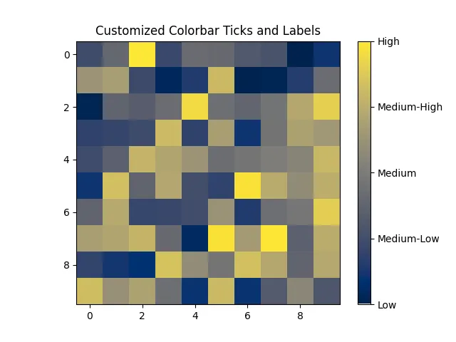
In this example, we first plot the heatmap and then customize the colorbar. The set_ticks method allows us to specify where the ticks should be placed, while set_ticklabels lets us define what those ticks should display. This customization can make your visualizations more accessible, especially for audiences who may not be familiar with the numerical values represented by the colors.
Conclusion
Mastering the colorbar range in Matplotlib is crucial for creating effective and interpretable visualizations. By utilizing techniques such as the vmin and vmax parameters, normalization, and customizing ticks and labels, you can enhance the clarity of your data representations. These skills not only improve the aesthetics of your plots but also make them more informative for your audience. As you continue to explore the capabilities of Matplotlib, remember that a well-managed colorbar can significantly impact the way your data is perceived.
FAQ
-
How do I set a colorbar range in Matplotlib?
You can set a colorbar range using thevminandvmaxparameters in your plotting functions. -
What is the purpose of the Normalize class in Matplotlib?
The Normalize class allows you to map your data values to the range of colors in the colormap, providing more flexibility in scaling your data.
-
Can I customize the ticks and labels on a colorbar?
Yes, you can customize the ticks and labels of a colorbar using theset_ticksandset_ticklabelsmethods. -
What colormaps are available in Matplotlib?
Matplotlib offers a variety of colormaps, including ‘viridis’, ‘plasma’, ‘cividis’, and many more. You can explore them in the Matplotlib documentation. -
How can I improve the readability of my colorbar?
You can improve readability by customizing the ticks and labels, ensuring that they are meaningful and easy to understand for your audience.

Manav is a IT Professional who has a lot of experience as a core developer in many live projects. He is an avid learner who enjoys learning new things and sharing his findings whenever possible.
LinkedIn