How to Overlay Plots in Matplotlib
- Method 1: Basic Overlay of Line Plots
- Method 2: Overlaying Bar and Line Plots
- Method 3: Using Subplots for Overlaying Multiple Plots
- Conclusion
- FAQ
Creating visual representations of data is an essential part of data analysis, and Matplotlib makes it easy to overlay multiple plots for better insights. Whether you’re comparing datasets, illustrating trends, or showcasing relationships, overlaying plots can enhance the clarity and effectiveness of your visualizations.
In this article, we’ll explore various methods to overlay plots in Matplotlib, providing you with practical examples and clear explanations. By the end, you’ll have a solid understanding of how to create layered visualizations that can elevate your data storytelling. Let’s dive in!
Method 1: Basic Overlay of Line Plots
One of the simplest ways to overlay plots in Matplotlib is by using the plot function multiple times on the same axes. This approach allows you to visualize different datasets in a single graph, making comparisons straightforward. Here’s a quick example of how to achieve this.
import matplotlib.pyplot as plt
import numpy as np

x = np.linspace(0, 10, 100)
y1 = np.sin(x)
y2 = np.cos(x)

plt.plot(x, y1, label='Sine Wave', color='blue')
plt.plot(x, y2, label='Cosine Wave', color='red')
plt.title('Overlaying Sine and Cosine Waves')
plt.xlabel('X-axis')
plt.ylabel('Y-axis')
plt.legend()
plt.show()
Output:
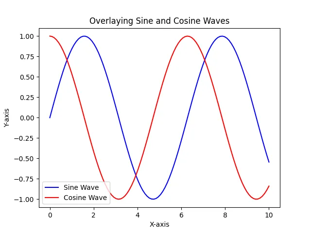
In this example, we first generate an array of x values ranging from 0 to 10. We then compute the sine and cosine values for these x values. By calling the plot function twice, we overlay the sine and cosine waves on the same axes. The label parameter helps in creating a legend, making it easier for viewers to distinguish between the two plots. The result is a clear and informative graph that showcases both functions simultaneously.
Method 2: Overlaying Bar and Line Plots
Another effective method to overlay plots is by combining bar plots with line plots. This can be particularly useful when you want to compare categorical data with continuous data. Let’s see how to do this with an example.
categories = ['A', 'B', 'C', 'D']
values = [3, 7, 2, 5]
line_values = [4, 6, 3, 4]

plt.bar(categories, values, color='lightblue', label='Bar Values', alpha=0.6)
plt.plot(categories, line_values, label='Line Values', color='orange', marker='o')
plt.title('Overlaying Bar and Line Plots')
plt.xlabel('Categories')
plt.ylabel('Values')
plt.legend()
plt.show()
Output:
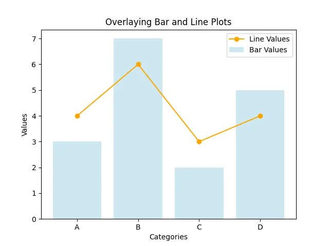
In this example, we create a bar plot for categorical data and overlay it with a line plot representing another set of values. The alpha parameter in the bar function allows us to adjust the transparency of the bars, making it easier to see the line plot underneath. This combination effectively highlights the relationship between categorical and continuous data, providing a more comprehensive view of the information.
Method 3: Using Subplots for Overlaying Multiple Plots
When dealing with multiple datasets, using subplots can be an effective way to overlay plots while maintaining clarity. This method allows you to create a grid of plots, where you can overlay individual plots on each subplot. Here’s how to do it:
fig, ax = plt.subplots(2, 1, figsize=(8, 6))

x = np.linspace(0, 10, 100)
y1 = np.sin(x)
y2 = np.cos(x)

ax[0].plot(x, y1, label='Sine Wave', color='blue')
ax[0].plot(x, y2, label='Cosine Wave', color='red')
ax[0].set_title('Overlay of Sine and Cosine Waves')
ax[0].legend()

y3 = np.tan(x)
ax[1].plot(x, y3, label='Tangent Wave', color='green')
ax[1].set_title('Tangent Wave')
ax[1].legend()

plt.tight_layout()
plt.show()
Output:

In this example, we create two subplots stacked vertically. The first subplot overlays the sine and cosine waves, while the second subplot displays the tangent wave. Using the tight_layout() function ensures that the plots are spaced evenly and do not overlap. This method is particularly useful when you have multiple datasets to compare, as it keeps the visualizations organized and easy to interpret.
Conclusion
Overlaying plots in Matplotlib is a powerful technique that can significantly enhance the way you present data. Whether you use simple line plots, combine bar and line plots, or utilize subplots for clarity, the ability to visualize multiple datasets simultaneously is invaluable. By mastering these methods, you can create informative and visually appealing graphics that effectively communicate your data insights. So, the next time you analyze data, consider overlaying your plots to provide a richer perspective.
FAQ
-
What is the purpose of overlaying plots in Matplotlib?
Overlaying plots allows for better comparison and visualization of multiple datasets in a single graph. -
Can I overlay different types of plots in Matplotlib?
Yes, you can overlay various types of plots, such as line plots, bar plots, and scatter plots, to provide a comprehensive view of your data. -
How do I customize the appearance of overlayed plots?
You can customize colors, markers, line styles, and transparency using parameters within the plotting functions. -
Is there a limit to how many plots I can overlay?
While there is no strict limit, overlaying too many plots can make the visualization cluttered and difficult to read. -
Can I save my overlayed plots as images?
Yes, you can save your plots using thesavefig()function in Matplotlib, allowing you to export your visualizations in various formats.

Hi, my name is Maxim Maeder, I am a young programming enthusiast looking to have fun coding and teaching you some things about programming.
GitHub