How to Create a Normalized Histogram Using Python Matplotlib
- What is a Normalized Histogram?
- Creating a Basic Normalized Histogram
- Customizing Your Normalized Histogram
- Adding Multiple Datasets to Your Normalized Histogram
- Conclusion
- FAQ

Creating visual representations of data is crucial for analysis, and one effective way to do this is through histograms. A normalized histogram is particularly useful as it allows you to compare distributions across different datasets on the same scale.
In this article, we will explore how to create a normalized histogram using Python’s Matplotlib library. Whether you’re a beginner or an experienced data analyst, this guide will walk you through the steps to visualize your data effectively. By the end, you’ll be able to create stunning normalized histograms that clearly communicate your data’s story.
What is a Normalized Histogram?
A normalized histogram transforms the raw counts of occurrences into proportions, which means the total area under the histogram equals 1. This transformation allows for easier comparison between datasets of different sizes. Instead of just counting how many times a value appears, normalization shows you the relative frequency of each value. This is particularly important in statistical analysis and data visualization, as it provides a clearer picture of the underlying distribution.
Creating a Basic Normalized Histogram
To create a normalized histogram, you will use the hist() function from Matplotlib. This function allows you to specify the dataset, the number of bins, and most importantly, the normalization option. Below is a simple example using random data.
import matplotlib.pyplot as plt
import numpy as np

data = np.random.randn(1000)
plt.hist(data, bins=30, density=True, alpha=0.5, color='blue')
plt.title('Normalized Histogram')
plt.xlabel('Value')
plt.ylabel('Density')
plt.grid(True)
plt.show()
Output:
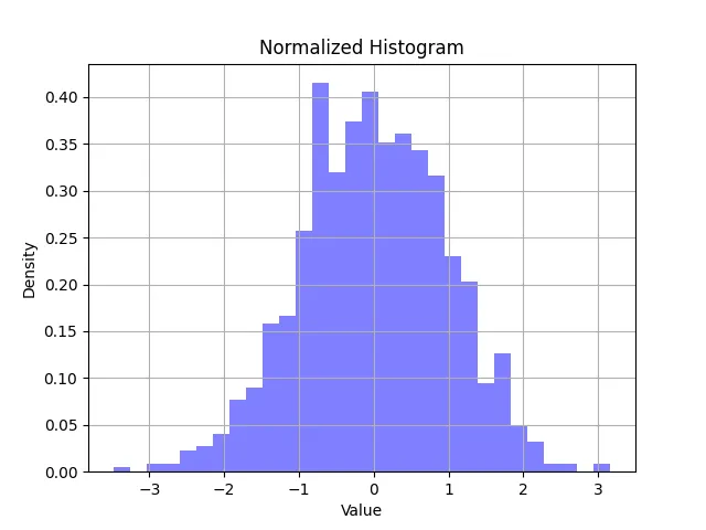
In this code, we first import the necessary libraries: Matplotlib for plotting and NumPy for generating random data. We create an array of 1000 random numbers drawn from a normal distribution using np.random.randn(). The plt.hist() function is called with the density=True argument, which normalizes the histogram. The bins parameter controls how many bars will be shown, and alpha sets the transparency of the bars. Finally, we display the histogram using plt.show().
This basic example gives you a clear view of how normalized histograms can represent data. You can tweak the number of bins or the dataset to see how it affects the histogram’s shape.
Customizing Your Normalized Histogram
Once you have the basics down, you might want to customize your histogram for better visuals or clarity. You can change colors, add grid lines, and modify labels. Here’s how you can enhance the previous example.
import matplotlib.pyplot as plt
import numpy as np

data = np.random.randn(1000)
plt.figure(figsize=(10, 6))
plt.hist(data, bins=30, density=True, alpha=0.6, color='green', edgecolor='black')
plt.title('Customized Normalized Histogram', fontsize=16)
plt.xlabel('Value', fontsize=14)
plt.ylabel('Density', fontsize=14)
plt.grid(axis='y', alpha=0.75)
plt.show()
Output:
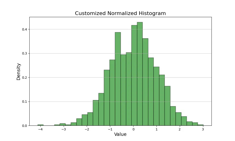
In this updated code, we use plt.figure() to set the figure size, making the histogram larger and more readable. The edgecolor parameter adds outlines to the bars, improving visual clarity. We also set font sizes for the title and labels to enhance readability. The grid is adjusted to only appear along the y-axis, providing a cleaner look. Customizing your histogram not only makes it visually appealing but also helps convey the data’s message more effectively.
Adding Multiple Datasets to Your Normalized Histogram
Sometimes, you may want to compare multiple datasets in a single histogram. This is where normalized histograms shine, as they allow for easy comparison. Let’s see how to overlay two datasets in one normalized histogram.
import matplotlib.pyplot as plt
import numpy as np

data1 = np.random.randn(1000)
data2 = np.random.randn(1000) + 1  # Shifted to the right

plt.hist(data1, bins=30, density=True, alpha=0.5, color='blue', label='Dataset 1')
plt.hist(data2, bins=30, density=True, alpha=0.5, color='red', label='Dataset 2')
plt.title('Normalized Histogram of Two Datasets')
plt.xlabel('Value')
plt.ylabel('Density')
plt.legend(loc='upper right')
plt.grid(True)
plt.show()
Output:
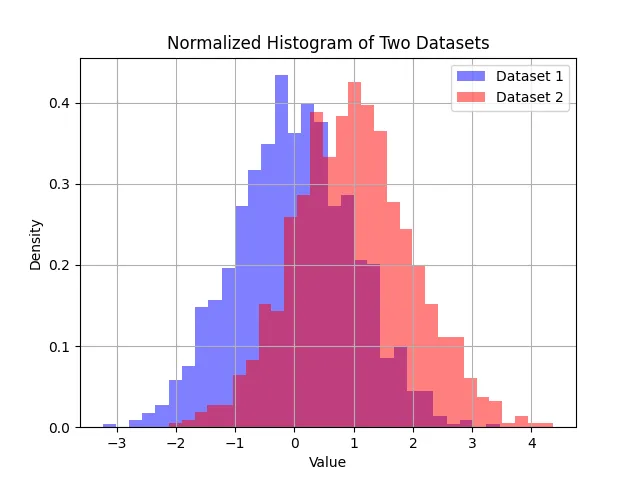
In this example, we generate two datasets: data1 and data2, where data2 is simply a shifted version of data1. The plt.hist() function is called twice, once for each dataset, with the label parameter used to differentiate them in the legend. This technique allows you to visually compare distributions effectively. You can see how the two datasets overlap and where they differ, making it easier to analyze the data.
Conclusion
Creating a normalized histogram using Python’s Matplotlib is a straightforward process that can greatly enhance your data visualization capabilities. By normalizing your data, you can make more meaningful comparisons across different datasets. Whether you are working with a single dataset or multiple datasets, the techniques discussed in this article will help you create informative and visually appealing histograms. So, go ahead and start visualizing your data with normalized histograms!
FAQ
-
what is a normalized histogram?
A normalized histogram shows the relative frequency of values rather than raw counts, allowing for easier comparison between datasets. -
how do I install Matplotlib?
You can install Matplotlib using pip by running the commandpip install matplotlibin your terminal or command line. -
can I customize the appearance of my histogram?
Yes, you can customize colors, labels, and other visual aspects using various parameters in theplt.hist()function. -
how do I compare multiple datasets using normalized histograms?
You can overlay multiple datasets in a single histogram by callingplt.hist()for each dataset and using different colors and transparency levels. -
what does the density parameter do in the hist function?
The density parameter, when set to True, normalizes the histogram so that the total area under the histogram equals 1.

Vaibhav is an artificial intelligence and cloud computing stan. He likes to build end-to-end full-stack web and mobile applications. Besides computer science and technology, he loves playing cricket and badminton, going on bike rides, and doodling.