How to Set Tick Label in Scientific Notation in Matplotlib
-
Using
ticklabel_format()Method -
Using
ScalarFormatterfor Customization -
Setting Scientific Notation with
FuncFormatter - Conclusion
- FAQ
Matplotlib is a powerful library in Python that allows you to create stunning visualizations with ease. One common challenge users face is displaying tick labels in scientific notation, especially when dealing with large datasets or values. This not only enhances readability but also makes your graphs look more professional. In this post, we will explore how to use the ticklabel_format() function in Matplotlib to set tick labels in scientific notation. Whether you’re a beginner or an experienced data scientist, this guide will provide you with simple, effective methods to achieve your visualization goals. Let’s dive in!
Using ticklabel_format() Method
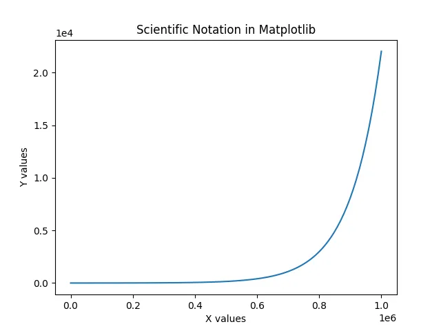
One of the most straightforward ways to display tick labels in scientific notation is by using the ticklabel_format() method. This function allows you to specify the format of the tick labels directly. Here’s how to implement it in your code.
import matplotlib.pyplot as plt
import numpy as np

x = np.linspace(1, 1e6, 100)
y = np.exp(x / 1e5)

plt.plot(x, y)
plt.ticklabel_format(style='scientific', axis='both', scilimits=(0, 0))
plt.xlabel('X values')
plt.ylabel('Y values')
plt.title('Scientific Notation in Matplotlib')
plt.show()
When you run this code, you’ll notice that both the x-axis and y-axis tick labels are formatted in scientific notation. The style parameter is set to 'scientific', which indicates that we want the labels displayed in scientific format. The axis parameter specifies which axis to apply this formatting to—here, we’ve applied it to both axes. The scilimits parameter controls the range of values that will be displayed in scientific notation. Setting it to (0, 0) ensures that all labels are shown in this format.
This method is particularly useful when you are working with datasets that span several orders of magnitude, as it keeps your graph clean and easy to interpret.
Using ScalarFormatter for Customization
Another effective way to set tick labels in scientific notation is by using the ScalarFormatter class from Matplotlib. This method provides more control over the formatting options, allowing for customization according to your needs.
import matplotlib.pyplot as plt
import numpy as np
from matplotlib.ticker import ScalarFormatter

x = np.linspace(1, 1e6, 100)
y = np.exp(x / 1e5)

plt.plot(x, y)
plt.gca().xaxis.set_major_formatter(ScalarFormatter(useMathText=True))
plt.gca().yaxis.set_major_formatter(ScalarFormatter(useMathText=True))
plt.xlabel('X values')
plt.ylabel('Y values')
plt.title('Custom Scientific Notation in Matplotlib')
plt.show()
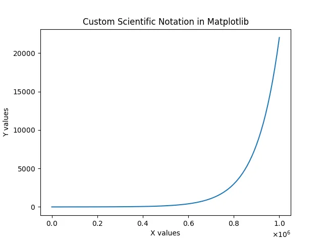
In this example, we import ScalarFormatter from matplotlib.ticker. By calling set_major_formatter() on both the x and y axes, we apply the ScalarFormatter with useMathText=True, which enhances the visual appearance of the scientific notation. This method is beneficial when you want more refined control over how the tick labels are displayed, such as changing the appearance of the exponent.
Using ScalarFormatter can be particularly advantageous if you want to maintain a consistent style across multiple plots or if you need to customize the formatting for specific datasets.
Setting Scientific Notation with FuncFormatter
For those who want even more flexibility, you can utilize FuncFormatter to define a custom function for formatting tick labels. This approach allows you to format tick labels in any way you desire, including scientific notation.
import matplotlib.pyplot as plt
import numpy as np
from matplotlib.ticker import FuncFormatter

def scientific(x, pos):
    return f'{x:.1e}'

x = np.linspace(1, 1e6, 100)
y = np.exp(x / 1e5)

plt.plot(x, y)
plt.gca().xaxis.set_major_formatter(FuncFormatter(scientific))
plt.gca().yaxis.set_major_formatter(FuncFormatter(scientific))
plt.xlabel('X values')
plt.ylabel('Y values')
plt.title('Custom Function for Scientific Notation in Matplotlib')
plt.show()
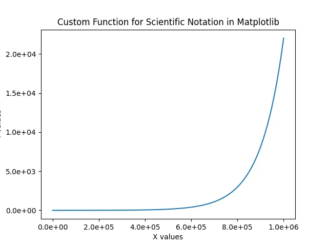
In this code snippet, we define a function called scientific that formats the tick labels in scientific notation using Python’s f-string feature. By passing this function to FuncFormatter, we set it as the major formatter for both axes. This method is extremely powerful because it allows you to define any formatting logic you want, giving you the ultimate flexibility in how your tick labels are displayed.
Using FuncFormatter can be particularly useful when working with specialized datasets or when you want to apply unique formatting rules that differ from standard scientific notation.
Conclusion
Setting tick labels in scientific notation in Matplotlib is essential for creating clear and professional-looking plots, especially when dealing with large datasets. By utilizing methods such as ticklabel_format(), ScalarFormatter, and FuncFormatter, you can easily customize your visualizations to suit your needs. Each method has its own strengths, so choose the one that best fits your project requirements. With these tools at your disposal, you’ll be well on your way to mastering data visualization in Python.
FAQ
- how do I display all tick labels in scientific notation?
use theticklabel_format()method with thescilimitsparameter set to(0, 0).
-
can I customize the appearance of the scientific notation?
yes, usingScalarFormatterorFuncFormatterallows for extensive customization of tick label formatting. -
what is the difference between
ticklabel_format()andScalarFormatter?
ticklabel_format()is simpler for basic formatting, whileScalarFormatterprovides more control over the appearance of tick labels. -
how do I apply scientific notation to only one axis?
specify the axis parameter inticklabel_format()or useset_major_formatter()on the desired axis withScalarFormatter. -
can I use scientific notation with logarithmic scales?
yes, you can combine scientific notation with logarithmic scales in Matplotlib for better visualization of data across orders of magnitude.

Shiv is a self-driven and passionate Machine learning Learner who is innovative in application design, development, testing, and deployment and provides program requirements into sustainable advanced technical solutions through JavaScript, Python, and other programs for continuous improvement of AI technologies.
LinkedInRelated Article - Matplotlib Ticks
- How to Rotate X-Axis Tick Label Text in Matplotlib
- How to Set Tick Labels Font Size in Matplotlib
- How to Hide Axis Text Ticks and/or Tick Labels in Matplotlib
- How to Set Number of Ticks in Matplotlib