How to Color Histogramm in Matplotlib
- Basic Histogram with Default Colors
- Customizing Histogram Colors
- Adding Transparency to Histogram Colors
- Final Touches: Adding Grid and Styling
- Conclusion
- FAQ
Creating visually appealing and informative histograms is essential for data analysis and presentation.
In this tutorial, we will explore how to color histograms in Matplotlib, a powerful library in Python for data visualization. Whether you’re a beginner or an experienced programmer, this guide will walk you through the steps needed to create colorful histograms that enhance your data storytelling. By the end of this tutorial, you will have the skills to customize your histograms with various colors, making your data stand out and easier to interpret. Let’s dive in!
Basic Histogram with Default Colors
Let’s start with a simple histogram using default colors. This will help you understand the basic structure of a histogram in Matplotlib.
import matplotlib.pyplot as plt
import numpy as np

data = np.random.randn(1000)
plt.hist(data)
plt.title('Basic Histogram')
plt.xlabel('Value')
plt.ylabel('Frequency')
plt.show()
Output:
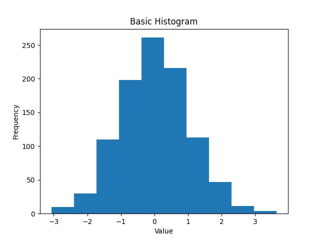
In this example, we generate 1,000 random numbers from a normal distribution using NumPy. We then create a histogram with the plt.hist() function. The histogram displays the frequency of values, with default colors applied. This serves as a foundation for our next steps in customizing colors.
Customizing Histogram Colors
Now that we have a basic histogram, let’s add some color to it. Matplotlib allows you to specify colors using various methods, such as color names, hex codes, or RGB tuples.
plt.hist(data, color='skyblue')
plt.title('Customized Histogram Color')
plt.xlabel('Value')
plt.ylabel('Frequency')
plt.show()
Output:
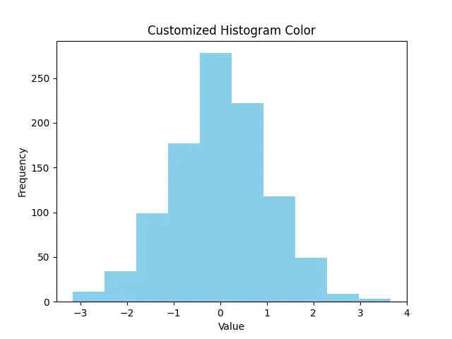
In this code, we specify the color of the histogram bars as ‘skyblue’. This simple change makes the visualization more appealing and can help highlight specific data trends. You can experiment with different color names or even use hex codes to achieve the desired look.
Adding Transparency to Histogram Colors
Adding transparency to your histogram colors can enhance the visual appeal and make overlapping data easier to interpret. You can adjust the transparency using the alpha parameter.
plt.hist(data, bins=30, color='purple', alpha=0.5)
plt.title('Histogram with Transparency')
plt.xlabel('Value')
plt.ylabel('Frequency')
plt.show()
Output:
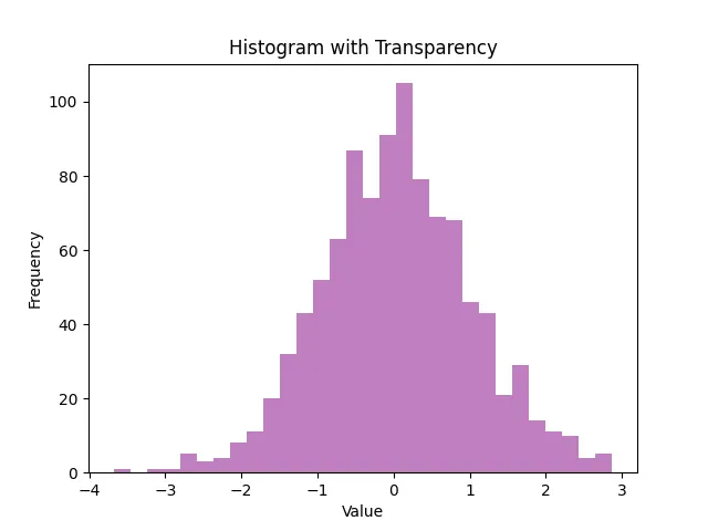
By setting alpha=0.5, we make the histogram bars semi-transparent. This allows underlying data or gridlines to be visible, which can be particularly useful when overlaying multiple histograms. Experimenting with different alpha values can lead to stunning visualizations that effectively communicate your data story.
Final Touches: Adding Grid and Styling
To make your histogram even more informative, consider adding gridlines and adjusting the overall style. Matplotlib provides various styling options to enhance your plots further.
plt.style.use('seaborn-darkgrid')
plt.hist(data, bins=30, color='teal', alpha=0.7)
plt.title('Styled Histogram')
plt.xlabel('Value')
plt.ylabel('Frequency')
plt.grid(True)
plt.show()
Output:
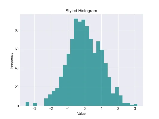
In this example, we use the seaborn-darkgrid style to give our histogram a professional look. The gridlines help guide the viewer’s eye and make it easier to interpret the data. You can explore other styles available in Matplotlib to find the one that best fits your presentation needs.
Conclusion
Creating colorful histograms in Matplotlib is a straightforward process that can significantly enhance your data visualizations. By customizing colors, adding transparency, and applying different styles, you can make your histograms not only informative but also visually appealing. Whether you’re presenting data in a report or conducting exploratory data analysis, these techniques will help you communicate your findings more effectively. Dive into Matplotlib and start experimenting with colors to bring your data to life!
FAQ
-
How can I change the color of a specific bin in a histogram?
You can achieve this by plotting individual bins separately or using a color array that specifies colors for each bin. -
Can I use images as backgrounds for my histogram?
Yes, you can add images as backgrounds, but it requires additional steps to adjust the transparency and layering of your plot. -
What is the best way to visualize overlapping histograms?
Using transparency (alpha) or creating a stacked histogram can help visualize overlapping data effectively. -
How do I save my colored histogram as an image file?
You can useplt.savefig('filename.png')beforeplt.show()to save your histogram as an image file. -
Are there any other libraries for creating histograms in Python?
Yes, libraries like Seaborn and Plotly also provide powerful tools for creating visually appealing histograms.

Hi, my name is Maxim Maeder, I am a young programming enthusiast looking to have fun coding and teaching you some things about programming.
GitHub