How to Plot List of X,y Coordinates in Matplotlib
Matplotlib is a powerful library in Python that allows you to create a variety of static, animated, and interactive visualizations. One of the most common tasks when working with data visualization is plotting a list of x, y coordinates. Whether you’re analyzing data trends, visualizing mathematical functions, or displaying experimental results, knowing how to plot these coordinates is essential.
In this tutorial, we will explore several methods to achieve this using Matplotlib. By the end of this guide, you’ll be equipped with the knowledge to create beautiful and informative plots that can enhance your data presentation.
Method 1: Basic Line Plot
The simplest way to plot a list of x, y coordinates in Matplotlib is by using the plot function. This method is straightforward and ideal for beginners. To illustrate this, let’s create a basic line plot using a set of coordinates.
import matplotlib.pyplot as plt

x = [1, 2, 3, 4, 5]
y = [2, 3, 5, 7, 11]

plt.plot(x, y)
plt.title("Basic Line Plot")
plt.xlabel("X-axis")
plt.ylabel("Y-axis")
plt.grid()
plt.show()
Output:

In this code, we first import the matplotlib.pyplot module. We then define two lists, x and y, which contain our coordinates. The plt.plot() function is called to create the line plot. The title, xlabel, and ylabel functions add titles and labels to the axes, making the plot more informative. Finally, plt.grid() adds a grid to the plot for better visualization, and plt.show() displays the plot. This method is great for visualizing trends over a continuous range of values.
Method 2: Scatter Plot
If you want to emphasize individual data points rather than connecting them with lines, a scatter plot is an excellent choice. This method is particularly useful when you have discrete data points. Let’s see how to create a scatter plot using Matplotlib.
import matplotlib.pyplot as plt

x = [1, 2, 3, 4, 5]
y = [2, 3, 5, 7, 11]

plt.scatter(x, y, color='red')
plt.title("Scatter Plot")
plt.xlabel("X-axis")
plt.ylabel("Y-axis")
plt.grid()
plt.show()
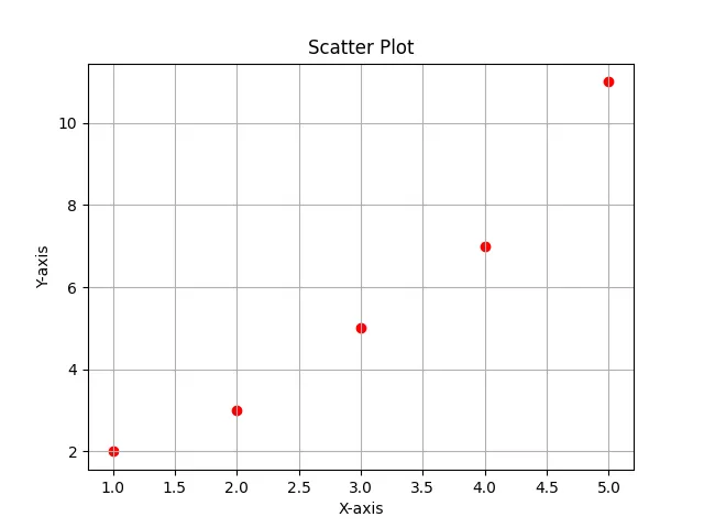
In this example, we use the plt.scatter() function instead of plt.plot(). This function allows you to specify the color of the points, which we’ve set to red. The other components, such as titles and labels, remain the same. Scatter plots are particularly useful for identifying clusters, outliers, or the distribution of data points across the coordinate system. This method provides a clear visual representation of how individual data points relate to each other.
Method 3: Customizing Your Plot
Matplotlib offers extensive customization options, allowing you to make your plots more visually appealing and informative. You can change colors, markers, line styles, and much more. Let’s explore how to customize a plot with various attributes.
import matplotlib.pyplot as plt

x = [1, 2, 3, 4, 5]
y = [2, 3, 5, 7, 11]

plt.plot(x, y, marker='o', linestyle='--', color='blue', markersize=10)
plt.title("Customized Line Plot")
plt.xlabel("X-axis")
plt.ylabel("Y-axis")
plt.xlim(0, 6)
plt.ylim(0, 12)
plt.grid()
plt.show()
Output:
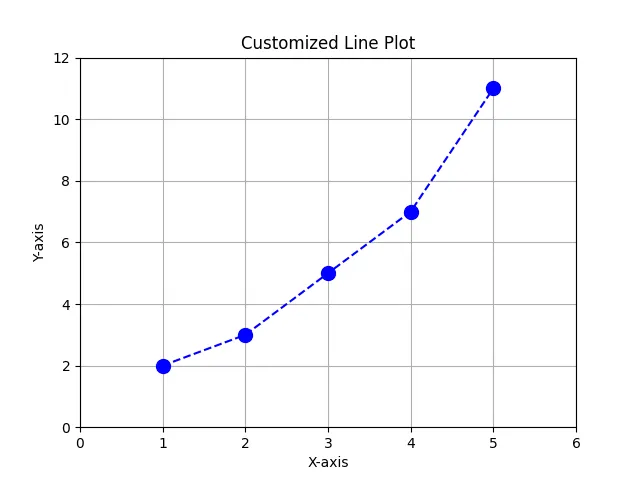
Here, we introduce several customization options. The marker parameter allows you to specify the shape of the data points, while linestyle defines how the line connecting the points looks. We set the color to blue and increased the markersize for better visibility. The xlim and ylim functions set the limits for the x and y axes, respectively. This level of customization helps to enhance the clarity and presentation of your plots, making them more effective for communication.
Conclusion
In this tutorial, we explored how to plot a list of x, y coordinates in Matplotlib using different methods. We started with a basic line plot, moved on to a scatter plot, and then delved into customization options to enhance our visualizations. Whether you’re a beginner or an experienced programmer, mastering these techniques will significantly improve your ability to present data effectively. With Matplotlib, the possibilities are endless, and you can create stunning visualizations that convey your data insights clearly.
FAQ
- How do I install Matplotlib?
You can install Matplotlib using pip with the commandpip install matplotlib.
-
Can I plot multiple lines on the same graph?
Yes, you can call theplt.plot()function multiple times before displaying the plot to add more lines. -
What file formats can I save my plots in?
You can save your plots in various formats, including PNG, PDF, SVG, and more, usingplt.savefig('filename.png'). -
Is Matplotlib suitable for 3D plotting?
Yes, Matplotlib supports 3D plotting through thempl_toolkits.mplot3dmodule. -
Can I add annotations to my plots?
Yes, you can use theplt.annotate()function to add text annotations to specific data points on your plot.

Founder of DelftStack.com. Jinku has worked in the robotics and automotive industries for over 8 years. He sharpened his coding skills when he needed to do the automatic testing, data collection from remote servers and report creation from the endurance test. He is from an electrical/electronics engineering background but has expanded his interest to embedded electronics, embedded programming and front-/back-end programming.
LinkedIn Facebook