How to Add a Y-Axis Label to the Secondary Y-Axis in Matplotlib
- Understanding the Basics of Y-Axis in Matplotlib
- Adding a Y-Axis Label to the Secondary Y-Axis
- Customizing the Y-Axis Label
-
DataFrame.plotMethod to Add a Y-Axis Label to the Secondary Y-Axis - Conclusion
- FAQ
When working with data visualization in Python, Matplotlib stands out as one of the most powerful libraries. One particular feature that can greatly enhance your plots is the ability to add labels to both primary and secondary y-axes. This is especially useful when you’re comparing datasets with different scales.
In this article, we’ll dive into how to add a y-axis label to the secondary y-axis in Matplotlib. By utilizing the axes object and the pandas DataFrame plot method, you can create informative and visually appealing graphs. Whether you’re a seasoned data analyst or just starting your journey into data visualization, this guide will provide you with the insights you need to improve your plots.
Understanding the Basics of Y-Axis in Matplotlib
Before diving into how to add a y-axis label to the secondary y-axis, it’s crucial to understand the structure of Matplotlib’s plotting system. Matplotlib allows you to create multiple axes in a single figure, which means you can have a primary y-axis and a secondary y-axis. The primary y-axis is typically used for the main dataset, while the secondary y-axis is useful for datasets with different units or scales.
To create a secondary y-axis, you can use the twinx() method, which creates a new y-axis that shares the same x-axis. This is where you can add your secondary y-axis label. Understanding this basic structure will help you navigate through the process of enhancing your visualizations effectively.
Adding a Y-Axis Label to the Secondary Y-Axis
To add a y-axis label to the secondary y-axis, you can follow a straightforward approach using Matplotlib. The following code snippet demonstrates how to accomplish this task:
import numpy as np
import matplotlib.pyplot as plt

a = np.linspace(0, 5, 100)

y1 = np.sin(2 * np.pi * a)
y2 = np.cos(2 * np.pi * a)

fig, ax1 = plt.subplots()

ax1.set_xlabel("time (s)")
ax1.set_ylabel("sin", color="red")
ax1.plot(a, y1, color=color)
ax1.tick_params(axis="y", labelcolor=color)

ax2 = ax1.twinx()
ax2.set_ylabel("cos", color="green")
ax2.plot(a, y2, color=color)
ax2.tick_params(axis="y", labelcolor=color)

fig.tight_layout()
plt.show()
Output:

In this example, we create sin and cos plots. The twinx() method is used to create a secondary y-axis. The set_ylabel() method is then called on both axes to set the labels. Notice how we color the labels to match the lines, which helps in identifying which dataset corresponds to which axis.
This method is effective for adding clarity to your plots, especially when dealing with different units or scales. It allows your audience to understand the relationship between the datasets at a glance.
Customizing the Y-Axis Label
You might want to customize the y-axis label further to make it more informative or visually appealing. This can include changing the font size, style, or even adding a specific format. Here’s how you can do that:
import matplotlib.pyplot as plt
import pandas as pd

data = {
    'x': [1, 2, 3, 4, 5],
    'y1': [10, 20, 25, 30, 40],
    'y2': [100, 200, 300, 400, 500]
}

df = pd.DataFrame(data)

fig, ax1 = plt.subplots()

ax1.plot(df['x'], df['y1'], 'g-')
ax1.set_ylabel('Primary Y-Axis', color='g', fontsize=12, fontstyle='italic')

ax2 = ax1.twinx()
ax2.plot(df['x'], df['y2'], 'b-')
ax2.set_ylabel('Secondary Y-Axis', color='b', fontsize=14, fontweight='bold')

plt.title('Customized Plot with Secondary Y-Axis')
plt.show()
Output:
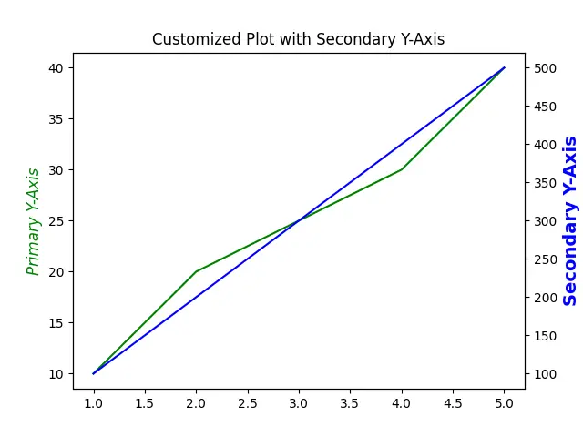
In this modified example, we adjust the font size and style of the y-axis labels. The primary y-axis label is italicized, while the secondary y-axis label is bolded and larger. Such customizations not only enhance readability but also add a professional touch to your visualizations.
By tailoring the appearance of your y-axis labels, you can guide your audience’s attention and make your data stories more compelling. This is especially useful in presentations or reports where clarity is paramount.
DataFrame.plot Method to Add a Y-Axis Label to the Secondary Y-Axis
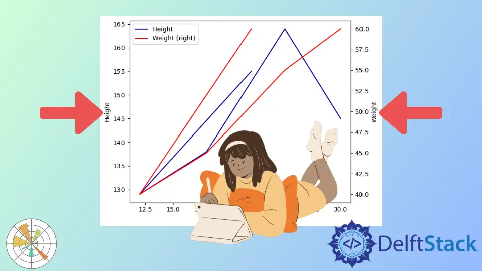
Another effective way to enhance your secondary y-axis is by adding units to the labels. This provides context and helps the audience understand the data at a glance. Here’s how to add units to the y-axis labels:
import pandas as pd
import matplotlib.pyplot as plt

df = pd.DataFrame(
    {
        "Age": [22, 12, 18, 25, 30],
        "Height": [155, 129, 138, 164, 145],
        "Weight": [60, 40, 45, 55, 60],
    }
)
ax = df.plot(kind="line", x="Age", y="Height", color="DarkBlue")

ax2 = df.plot(kind="line", x="Age", y="Weight", secondary_y=True, color="Red", ax=ax)

ax.set_ylabel("Height")
ax2.set_ylabel("Weight")
plt.tight_layout()
plt.show()
Output:

In this example, we visualize how height and weight vary with age using a dual-axis line plot. The primary y-axis displays height in dark blue, while the secondary y-axis shows weight in red. This allows for a direct comparison of how these two metrics change across the age range.
By using secondary_y=True, we create a separate scale for weight, effectively highlighting the different magnitudes of height and weight changes. This approach is valuable for revealing relationships between variables with different units or scales, enhancing the clarity of our data representation.
Conclusion
Adding a y-axis label to the secondary y-axis in Matplotlib is a straightforward yet powerful way to enhance your data visualizations. By using the twinx() method and customizing your labels, you can create informative plots that effectively communicate your data’s story. Whether you’re adding units or adjusting the font styles, these small changes can make a big difference in clarity and professionalism. With the techniques outlined in this article, you’ll be well-equipped to create compelling visualizations that resonate with your audience.
FAQ
-
how do I create a secondary y-axis in Matplotlib?
You can create a secondary y-axis by using thetwinx()method on an existing axes object. -
can I customize the appearance of the y-axis labels?
Yes, you can customize the appearance of y-axis labels using methods likeset_ylabel()to change font size, style, and color. -
what is the purpose of having a secondary y-axis?
A secondary y-axis is useful for comparing datasets with different scales or units, allowing for better data visualization. -
how do I add units to my y-axis labels?
You can add units by simply including them in the string passed to theset_ylabel()method. -
is it possible to plot multiple datasets on the same axes?
Yes, you can plot multiple datasets on the same axes by using different y-axes or by overlaying them on the same axis.

Suraj Joshi is a backend software engineer at Matrice.ai.
LinkedIn