How to Plot Quiver Diagram in Matplotlib
- Understanding Quiver Diagrams
- Basic Quiver Plot
- Customizing Quiver Diagrams
- Adding Annotations and Customizing Arrows
- Conclusion
- FAQ
Creating visual representations of data is crucial in data analysis and scientific research. One such visualization tool is the quiver diagram, which is particularly useful for displaying vector fields.
In this tutorial, we will dive into how to plot quiver diagrams using Matplotlib, a powerful plotting library in Python. Whether you’re a beginner or an experienced programmer, this guide will walk you through the process step by step. By the end of this article, you’ll not only understand how to create quiver diagrams but also how to customize them to suit your needs. Let’s get started!
Understanding Quiver Diagrams
Before we jump into the code, let’s clarify what a quiver diagram is. A quiver diagram is a graphical representation of a vector field, where arrows indicate both the direction and magnitude of vectors at different points in a grid. This type of diagram is particularly useful in physics and engineering to visualize forces, fluid flow, or any scenario where direction and magnitude are essential.
In Matplotlib, the quiver function is used to create these diagrams. The function takes in the x and y coordinates of the arrows, along with their respective u and v components, which represent the direction and magnitude of the vectors.
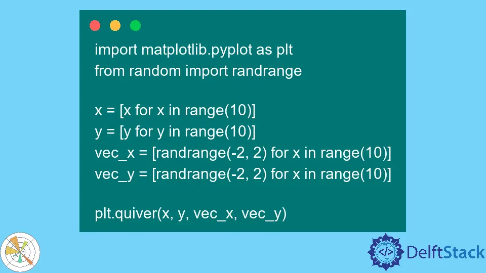
Basic Quiver Plot
To create a basic quiver plot, you need to set up your environment first. Make sure you have Matplotlib installed. If you haven’t installed it yet, you can do so via pip:
pip install matplotlib
Once you have Matplotlib ready, you can start plotting. Below is a simple example of how to create a quiver plot.
import numpy as np
import matplotlib.pyplot as plt

Y, X = np.mgrid[-3:3:100j, -3:3:100j]
U = -1 - X**2 + Y
V = 1 + X - Y**2

plt.figure()
plt.quiver(X, Y, U, V)
plt.xlim(-3, 3)
plt.ylim(-3, 3)
plt.title('Basic Quiver Plot')
plt.xlabel('X-axis')
plt.ylabel('Y-axis')
plt.grid()
plt.show()
In this example, we first create a grid using np.mgrid, which generates a mesh of points over the specified range. The U and V variables represent the vector components at each point on the grid. The quiver function then plots these vectors. The resulting diagram will display arrows that indicate the flow of the vector field in the defined space.
Customizing Quiver Diagrams
Customization is key to making your visualizations stand out. Matplotlib allows you to modify various aspects of your quiver plots, such as color, scale, and arrow length. Below, we’ll enhance our previous example by adding color mapping to represent the magnitude of the vectors.
import numpy as np
import matplotlib.pyplot as plt

Y, X = np.mgrid[-3:3:100j, -3:3:100j]
U = -1 - X**2 + Y
V = 1 + X - Y**2
magnitude = np.sqrt(U**2 + V**2)

plt.figure()
plt.quiver(X, Y, U, V, magnitude, cmap='jet', scale=30)
plt.colorbar(label='Magnitude')
plt.xlim(-3, 3)
plt.ylim(-3, 3)
plt.title('Customized Quiver Plot')
plt.xlabel('X-axis')
plt.ylabel('Y-axis')
plt.grid()
plt.show()
Output:
A quiver plot with color mapping indicating the magnitude of the vectors.
In this code, we calculate the magnitude of the vectors using the formula np.sqrt(U**2 + V**2). We then pass this magnitude to the quiver function, along with a colormap (cmap='jet') to visually represent the strength of the vectors. The scale parameter adjusts the length of the arrows, ensuring they fit well within the plot. The addition of a color bar provides a reference for interpreting the magnitude of the vectors.
Adding Annotations and Customizing Arrows
Annotations can significantly enhance the clarity of your quiver diagrams. They provide context, making it easier for viewers to understand the significance of the vectors. Below is an example of how to add annotations and customize the appearance of the arrows in your quiver plot.
import numpy as np
import matplotlib.pyplot as plt

Y, X = np.mgrid[-3:3:100j, -3:3:100j]
U = -1 - X**2 + Y
V = 1 + X - Y**2

plt.figure()
Q = plt.quiver(X, Y, U, V, color='r', alpha=0.6, angles='xy', scale_units='xy', scale=0.5)
plt.xlim(-3, 3)
plt.ylim(-3, 3)
plt.title('Quiver Plot with Annotations')
plt.xlabel('X-axis')
plt.ylabel('Y-axis')
plt.grid()

# Adding annotations
plt.text(0, 0, 'Origin', fontsize=12, color='blue')
plt.text(1, 1, 'Vector Point', fontsize=12, color='blue')

plt.show()
Output:
A quiver plot with annotations indicating the origin and a specific vector point.
In this example, we customize the arrows by changing their color to red and adjusting their transparency with the alpha parameter. We also specify the angles, scale_units, and scale to control how the arrows are displayed. The plt.text function is used to add annotations, which helps clarify important points on the plot. This level of detail can make your diagrams more informative and visually appealing.
Conclusion
Creating quiver diagrams in Matplotlib is a straightforward yet powerful way to visualize vector fields. From basic plots to more customized versions with color mapping and annotations, the possibilities are extensive. With these techniques in hand, you can effectively communicate complex data in a visually engaging manner. Whether for academic purposes, presentations, or personal projects, mastering quiver diagrams will enhance your data visualization skills significantly.
FAQ
- what is a quiver diagram?
A quiver diagram is a graphical representation of a vector field, where arrows indicate the direction and magnitude of vectors at different points.
-
how do I install Matplotlib?
You can install Matplotlib using pip with the command: pip install matplotlib. -
can I customize the colors in a quiver plot?
Yes, you can customize the colors in a quiver plot by using thecmapparameter in thequiverfunction. -
what does the scale parameter do in a quiver plot?
The scale parameter adjusts the length of the arrows in the quiver plot, allowing you to fit them appropriately within the plot area. -
how can I add annotations to my quiver plot?
You can add annotations using theplt.textfunction, specifying the coordinates and text you want to display.

Hi, my name is Maxim Maeder, I am a young programming enthusiast looking to have fun coding and teaching you some things about programming.
GitHub