How to Show Colorbar in Matplotlib
- Method 1: Basic Colorbar with imshow
- Method 2: Colorbar for Contour Plots
- Method 3: Customizing the Colorbar
- Conclusion
- FAQ
Matplotlib is one of the most popular libraries for data visualization in Python. One of its powerful features is the ability to add a colorbar to your plots. A colorbar provides a key for interpreting the colors in your visualization, making it easier for viewers to understand the data being presented.
In this tutorial, we will explore how to show a colorbar in Matplotlib figures, enhancing your plots and providing clarity to your audience. Whether you’re working on a heatmap, scatter plot, or any other type of visualization, this guide will help you integrate colorbars seamlessly into your work.
Before diving into the methods for displaying colorbars, it’s important to understand what they represent. A colorbar is a graphical representation of the data values associated with the colors in your plot. It acts as a legend, indicating how colors correspond to specific values or ranges of values in your dataset. This is especially useful in heatmaps or other visualizations where color intensity represents magnitude.
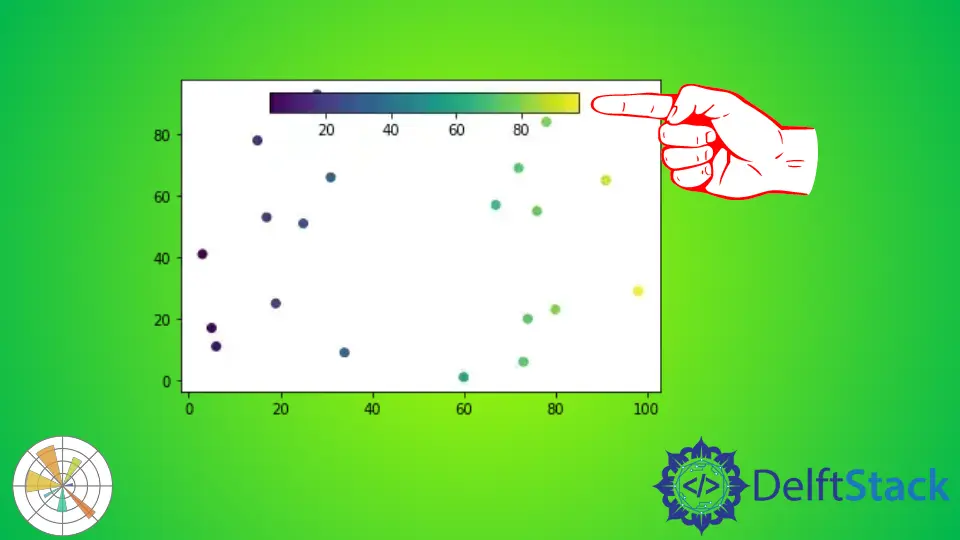
Method 1: Basic Colorbar with imshow
The simplest way to add a colorbar in Matplotlib is by using the imshow function, which displays data as an image. Here’s how you can do it:
```python
import random
import matplotlib.pyplot as plt

s_x = random.sample(range(0, 100), 20)
s_y = random.sample(range(0, 100), 20)

s = plt.scatter(s_x, s_y, c=s_x, cmap="viridis")

c = plt.colorbar()

In this example, we first import the necessary libraries: matplotlib.pyplot for plotting and numpy for generating random data. The cmap parameter specifies the colormap. The colorbar() function adds a colorbar to the side of the plot, allowing viewers to interpret the color intensities in relation to the data values. Finally, plt.show() displays the plot.
Method 2: Colorbar for Contour Plots
Another effective way to use colorbars is in contour plots. Contour plots represent three-dimensional data in two dimensions using contour lines. Here’s how to add a colorbar to a contour plot:
import matplotlib.pyplot as plt
import numpy as np

x = np.linspace(-3.0, 3.0, 100)
y = np.linspace(-3.0, 3.0, 100)
X, Y = np.meshgrid(x, y)
Z = np.sin(np.sqrt(X**2 + Y**2))

<!--undrads2-->

contour = plt.contourf(X, Y, Z, cmap='plasma')
plt.colorbar(contour)
plt.show()
Output:

In this code, we create a grid of points using numpy’s meshgrid function. The Z values are calculated using the sine function, generating a smooth surface. The contourf function is used to create filled contour plots, and again, we specify a colormap with the cmap parameter. The plt.colorbar(contour) line adds a colorbar specifically for the contour plot, helping to clarify the value ranges represented by different colors. Finally, plt.show() renders the plot.
Method 3: Customizing the Colorbar
Customizing the appearance of your colorbar can enhance the readability and aesthetics of your plots. You can adjust its location, orientation, and even the ticks displayed. Here’s an example of how to customize a colorbar:
import matplotlib.pyplot as plt
import numpy as np

data = np.random.rand(10, 10)
heatmap = plt.imshow(data, cmap='coolwarm')
cbar = plt.colorbar(heatmap)

<!--undrads3-->

cbar.set_label('Intensity', rotation=270, labelpad=15)
cbar.ax.tick_params(labelsize=10)
plt.show()
Output:
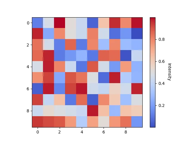
In this example, we again create a heatmap using random data. After adding the colorbar, we customize it by setting a label with set_label(), rotating it for better visibility, and adjusting the padding. The tick_params() method allows us to change the font size of the ticks on the colorbar for improved readability. These small adjustments can significantly enhance the clarity of your visualizations, making them more professional and easier to interpret.
Conclusion
Adding a colorbar to your Matplotlib visualizations is a straightforward yet impactful way to enhance the clarity and professionalism of your plots. By using the methods outlined in this guide—whether for basic images, contour plots, or customized colorbars—you can effectively communicate the nuances of your data. Remember, a well-placed colorbar not only aids in interpretation but also adds an aesthetic touch to your visualizations. So go ahead and experiment with these techniques to elevate your data presentations!
FAQ
-
How do I change the colormap in Matplotlib?
You can change the colormap by using thecmapparameter in plotting functions likeimshoworcontourf. For example,cmap='plasma'will apply the plasma colormap. -
Can I position the colorbar differently?
Yes, you can position the colorbar using theorientationparameter. Set it to'horizontal'or'vertical'based on your layout preferences. -
Is it possible to customize the ticks on the colorbar?
Absolutely! You can customize ticks usingset_ticks()andset_ticklabels()methods on the colorbar object. -
What types of plots work well with colorbars?
Colorbars are particularly useful in heatmaps, contour plots, and any visualization where color intensity represents a range of values. -
How can I save my plot with a colorbar?
You can save your plot usingplt.savefig('filename.png')before callingplt.show(). This will include the colorbar in the saved image.

Manav is a IT Professional who has a lot of experience as a core developer in many live projects. He is an avid learner who enjoys learning new things and sharing his findings whenever possible.
LinkedIn