How to Plot Multiple Plots in MATLAB
-
Using the
figureCommand - Subplotting for Compact Visualization
- Combining Multiple Plots in One Figure
- Conclusion
- FAQ

Creating multiple plots in MATLAB can enhance your data visualization efforts, allowing for a clearer understanding of complex datasets. Whether you’re analyzing scientific data, engineering metrics, or financial trends, the ability to display multiple plots simultaneously can be a game-changer. The figure command in MATLAB is a powerful tool that enables you to create separate windows for your plots, making it easy to compare and analyze different datasets side by side.
In this article, we will explore various methods to plot multiple plots in MATLAB, providing you with practical examples and explanations to help you master this essential skill.
Using the figure Command
The figure command is fundamental in MATLAB for creating new figure windows. When you want to plot multiple graphs, using this command allows you to open a new figure window for each plot. This method is straightforward and effective for visualizing different datasets without cluttering a single figure.
Here’s how you can use the figure command to create multiple plots:
x = -1:0.1:1;
y1 = sin(2*pi*t);
y2 = cos(2*pi*t);

figure;
plot(x, y1);
title('Sine Function');

figure;
plot(x, y2);
title('Cosine Function');
Output:

In this example, we define a range of x values from 0 to 10. We then compute the sine and cosine of these values, storing them in y1 and y2, respectively. The figure command opens a new window for each plot, allowing you to visualize the sine function in one window and the cosine function in another. This approach is particularly useful when you want to keep your plots distinct and easily accessible for comparison.
Subplotting for Compact Visualization
Another effective method for plotting multiple graphs in MATLAB is using the subplot function. This function allows you to create multiple plots within a single figure window, arranged in a grid format. Subplotting is especially beneficial when you want to save screen space or create a cohesive visual representation of related datasets.
Here’s how to use the subplot function:
x = 0:0.1:10;
y1 = sin(x);
y2 = cos(x);
y3 = tan(x);

figure;

subplot(3, 1, 1);
plot(x, y1);
title('Sine Function');

subplot(3, 1, 2);
plot(x, y2);
title('Cosine Function');

subplot(3, 1, 3);
plot(x, y3);
title('Tangent Function');
Output:

In this code, we have three functions: sine, cosine, and tangent. The subplot(3, 1, n) command creates a 3-row by 1-column grid for our plots. Each n value corresponds to a specific plot position in the grid. This method not only saves space but also provides a unified view of the different functions, making it easier to compare their behaviors visually.
Combining Multiple Plots in One Figure
Sometimes, you may want to overlay multiple plots in a single figure to compare their trends directly. MATLAB makes this easy with the hold on command, which allows you to plot additional data on the same axes without erasing the previous plot.
Here’s how to combine multiple plots in one figure:
x = 0:0.1:10;
y1 = sin(x);
y2 = cos(x);

figure;
plot(x, y1, 'r');
hold on;
plot(x, y2, 'b');
title('Sine and Cosine Functions');
legend('Sine', 'Cosine');
hold off;
Output:
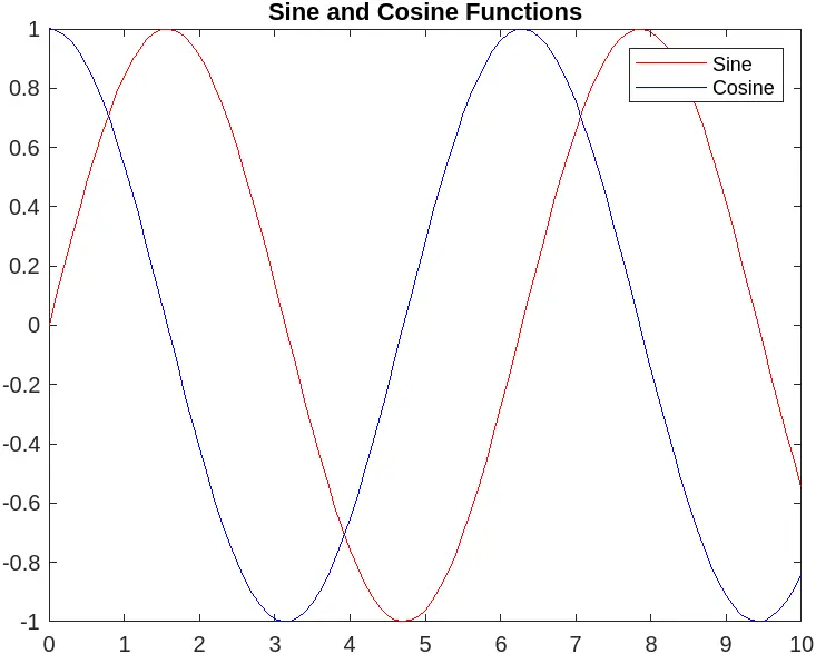
In this example, we plot the sine function in red and the cosine function in blue on the same axes. The hold on command allows the second plot to be added without clearing the first. Using a legend helps distinguish between the two functions, making the graph more informative. This technique is particularly useful when you want to highlight relationships or differences between datasets.
Conclusion
Mastering the art of plotting multiple plots in MATLAB is an invaluable skill for anyone working with data visualization. By utilizing commands like figure, subplot, and hold on, you can create clear and informative visual representations of your data. Whether you choose to display your plots in separate windows or combine them in a single figure, MATLAB provides the tools you need to effectively analyze and present your findings. With practice, you’ll be able to create compelling visualizations that enhance your data analysis and communication.
FAQ
-
How can I customize the appearance of my plots in MATLAB?
You can customize your plots using various properties, such as color, line style, and markers. Use commands likesetandgcato modify axes and figure properties. -
What is the difference between
figureandsubplot?
Thefigurecommand opens a new window for each plot, whilesubplotallows you to create multiple plots within a single window, arranged in a grid format. -
Can I save my plots in MATLAB?
Yes, you can save your plots using thesaveascommand or theprintfunction, allowing you to export your figures in various formats like PNG, JPEG, or PDF. -
How do I add labels and titles to my plots?
You can add labels to your axes using thexlabelandylabelcommands, and titles using thetitlecommand to provide context to your plots. -
Is it possible to create animated plots in MATLAB?
Yes, MATLAB allows for the creation of animated plots using loops and thepausefunction, enabling dynamic visualizations of changing data.
