How to Plot Graph Using the for Loop in MATLAB
- Basic Plotting with a for Loop
- Customizing Graphs with for Loops
- Creating Subplots with for Loops
- Conclusion
- FAQ
Creating visualizations is an essential part of data analysis, and MATLAB provides powerful tools to help you plot graphs efficiently. One of the fundamental programming structures in MATLAB is the for loop, which allows you to iterate through data and create dynamic plots.
In this tutorial, we will explore how to plot graphs using for loops in MATLAB, making it easy for you to visualize your data. Whether you’re a beginner or looking to enhance your skills, this guide will provide you with clear examples and explanations. Let’s dive into the world of MATLAB plotting and see how for loops can simplify your graphing tasks.
Basic Plotting with a for Loop
Usually, the for loop is not used to plot simple graphs in MATLAB because MATLAB has many functions to plot simple graphs. For example, the doc plot can be used for plotting graphs, taking several vectors’ matrices as inputs.
Sometimes, the for loop can plot the graph with several data. For example, if you have several data and want to plot them in a single matrix, you can use the for loop.
For example, you have two matrices, Ab(L x D) and Ac(L x D), where L is the length for each data and D is the amount of different data wanted for the plot.
Let’s try to implement this scenario in MATLAB:
% Create Ab and Ac
Ab=meshgrid(0:0.3:30,1:4);
Ac=zeros(size(Ab));
% Sinusoidals of different frequencies
for k=1:3
  Ac(k,:)=sin(k.*Ab(k,:));
end
% colors of the plot
PlotColors = hsv(3);
% Plot
hold on
for k=1:3
  plot(Ab(k,:),Ac(k,:),'Color',PlotColors(k,:))
end
hold off
The code above includes two matrices with different data plotted in one matrix using the for loop. The output plot for the code is:

Customizing Graphs with for Loops
Customization is key when it comes to data visualization. Let’s see how we can enhance our plots using for loops to create a more visually appealing graph. We will plot the sine wave again but will customize the line style, color, and markers.
x = 0:0.1:2*pi;
frequencies = [1, 2, 3];
PlotColors = ['r', 'g', 'b'];

figure;
hold on;

for k = 1:length(frequencies)
    y = sin(frequencies(k) * x);
    plot(x, y, 'Color', PlotColors(k), 'LineWidth', 2, 'LineStyle', '--', 'Marker', 'o', 'MarkerSize', 6)
end

title('Customized Sine Waves');
xlabel('X values (radians)');
ylabel('Sine of X');
legend('f = 1', 'f = 2', 'f = 3');
grid on;
hold off;
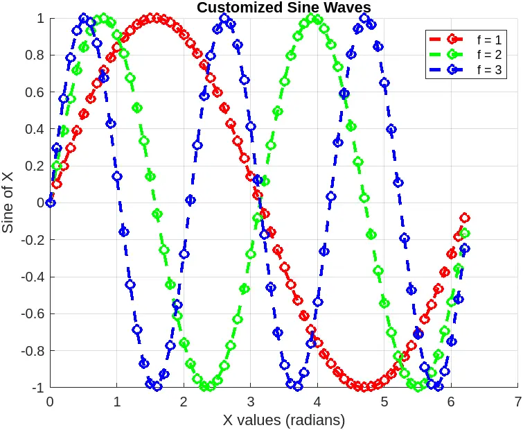
In this example, we use a for loop to plot multiple sine waves with different frequencies. The plot function is called within the loop, allowing us to customize each line individually. We use different colors for each line, set the line style to dashed, and add circle markers.
Customizing your plots can significantly enhance their effectiveness. By using for loops to handle data, you maintain flexibility while applying various visual styles to your graphs.
Creating Subplots with for Loops
Subplots allow you to display multiple plots in a single figure, which can be particularly useful for comparative analysis. Let’s create subplots for sine and cosine waves using for loops.
x = 0:0.1:2*pi;
amplitudes = [1, 0.5, 2];

figure;

for k = 1:length(amplitudes)
    subplot(length(amplitudes), 1, k);
    y = amplitudes(k) * sin(x);
    plot(x, y, 'Color', PlotColors(k), 'LineWidth', 2)
    title(['Sine Wave with Amplitude ', num2str(amplitudes(k))]);
    xlabel('X values (radians)');
    ylabel('Sine of X');
    grid on;
end
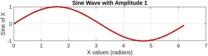
In this code, we use a for loop to create multiple subplots, each displaying a sine wave with a different amplitude. The subplot function is called within the loop, creating a new subplot for each iteration.
Using for loops in this way allows for efficient creation of multiple plots or subplots, each with its own customizations. This approach is particularly useful when dealing with datasets that require similar processing or visualization techniques.
Conclusion
In this article, we explored how to plot graphs using for loops in MATLAB. We covered basic plotting, multiple functions, customization, and subplots, providing you with a comprehensive understanding of how to visualize data effectively. By leveraging the power of for loops, you can manage your data and create dynamic, informative plots that enhance your analysis. Whether you’re working on academic projects or professional data analysis, mastering these techniques will undoubtedly elevate your MATLAB skills.
FAQ
- what is a for loop in MATLAB?
A for loop in MATLAB is a control flow statement that allows you to execute a block of code multiple times, iterating over a specified range or array.
-
can I plot more than two functions using a for loop?
Yes, you can plot multiple functions by creating additional arrays for each function and iterating through them in a for loop. -
how do I customize the appearance of my plots in MATLAB?
You can customize your plots by adjusting parameters such as line style, color, markers, and adding titles and labels using the plot function. -
what is the purpose of subplots in MATLAB?
Subplots allow you to display multiple plots within a single figure, enabling easy comparison of different datasets or functions. -
how do I improve the readability of my graphs in MATLAB?
You can enhance readability by adding grid lines, labels, legends, and adjusting the size and style of your lines and markers.

Sheeraz is a Doctorate fellow in Computer Science at Northwestern Polytechnical University, Xian, China. He has 7 years of Software Development experience in AI, Web, Database, and Desktop technologies. He writes tutorials in Java, PHP, Python, GoLang, R, etc., to help beginners learn the field of Computer Science.
LinkedIn Facebook