How to Plot 3D Contour in MATLAB
- Understanding the Basics of Contour Plots
- Creating a Simple 3D Contour Plot
- Customizing Your 3D Contour Plot
- Adding Color Maps to Your 3D Contour Plot
- Conclusion
- FAQ
Creating stunning visualizations is a crucial aspect of data analysis, and one powerful tool for achieving this in MATLAB is the 3D contour plot. The contour3() function allows users to represent three-dimensional data in a visually appealing manner, making it easier to interpret complex datasets. Whether you’re working on scientific research, engineering projects, or data visualization tasks, mastering the art of 3D contour plotting can significantly enhance your analytical capabilities.
In this article, we’ll explore how to effectively use the contour3() function in MATLAB, guiding you through the process step by step.
Understanding the Basics of Contour Plots
Before diving into the specifics of creating a 3D contour plot, it’s essential to understand what a contour plot is. In essence, contour plots are graphical representations of three-dimensional data, where lines connect points of equal value. This technique helps visualize the distribution of values across a given area or volume. In MATLAB, the contour3() function is specifically designed for this purpose, allowing you to create three-dimensional contour plots with ease.
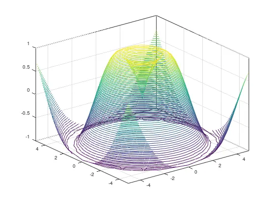
Creating a Simple 3D Contour Plot
To get started with a basic 3D contour plot in MATLAB, you’ll first need to define a grid of data points. This is typically done using meshgrid to create a grid of X and Y coordinates, followed by calculating the corresponding Z values. Here’s how you can do it:
[X, Y] = meshgrid(-5:0.5:5, -5:0.5:5);
Z = sin(sqrt(X.^2 + Y.^2));
contour3(X, Y, Z, 50);
xlabel('X-axis');
ylabel('Y-axis');
zlabel('Z-axis');
title('3D Contour Plot Example');
grid on;
Output:
In this example, we first create a grid of X and Y values ranging from -5 to 5 with a step of 0.5. The Z values are calculated using the sine function applied to the square root of the sum of squares of X and Y. The contour3() function then generates a 3D contour plot with 50 contour lines, providing a clear visualization of the data.
Customizing Your 3D Contour Plot
Customization is key to making your plots more informative and visually appealing. MATLAB provides various options to tweak the appearance of your 3D contour plots. You can modify colors, add labels, or even adjust the number of contour levels displayed. Here’s an example that demonstrates some of these customization options:
[X, Y] = meshgrid(-5:0.5:5, -5:0.5:5);
Z = sin(sqrt(X.^2 + Y.^2));
contour3(X, Y, Z, 30, 'LineColor', 'r', 'LineWidth', 2);
xlabel('X-axis');
ylabel('Y-axis');
zlabel('Z-axis');
title('Customized 3D Contour Plot');
grid on;
Output:
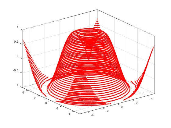
In this customized example, we specify the number of contour levels to be 30 and change the line color to red using the LineColor parameter. Additionally, we increase the line width for better visibility with the LineWidth parameter. These small adjustments can significantly enhance the readability and aesthetic appeal of your plot, making it easier for viewers to understand the data being presented.
Adding Color Maps to Your 3D Contour Plot
Color maps are an excellent way to convey additional information in your 3D contour plots. By incorporating color gradients, you can represent different ranges of Z values more effectively. MATLAB offers various built-in color maps that can be applied to your plots. Here’s how you can add a color map to your 3D contour plot:
[X, Y] = meshgrid(-5:0.5:5, -5:0.5:5);
Z = sin(sqrt(X.^2 + Y.^2));
contour3(X, Y, Z, 40);
colormap(jet);
colorbar;
xlabel('X-axis');
ylabel('Y-axis');
zlabel('Z-axis');
title('3D Contour Plot with Color Map');
grid on;
Output:
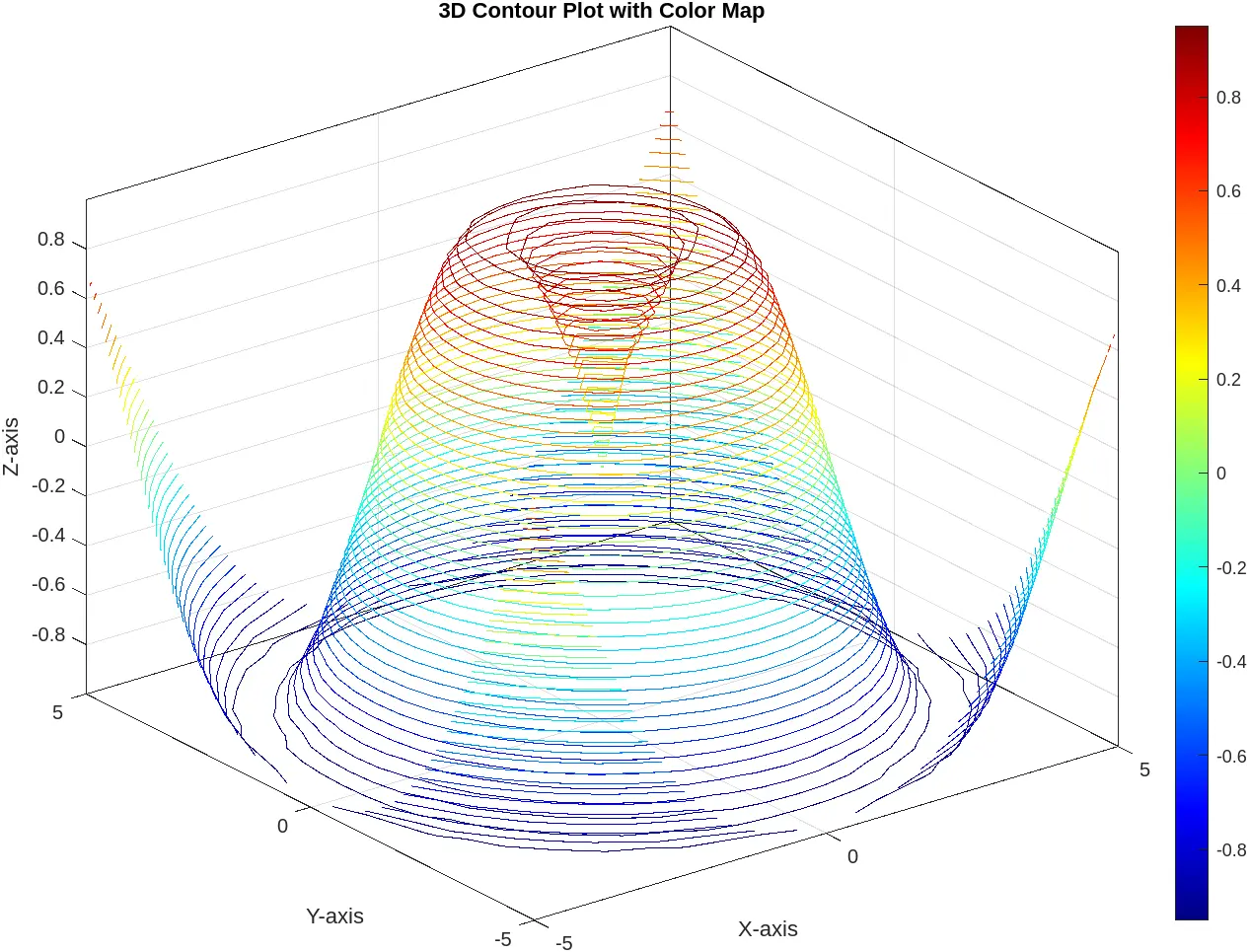
In this example, we again create a 3D contour plot with 40 contour lines. However, we enhance the visualization by applying the jet color map, which provides a vibrant gradient of colors. The colorbar function adds a color scale alongside the plot, helping viewers understand the relationship between the color gradient and the Z values. This approach not only makes the plot more visually appealing but also improves its interpretability.
Conclusion
Creating 3D contour plots in MATLAB using the contour3() function is a straightforward yet powerful way to visualize complex data. With the ability to customize plots, add color maps, and enhance visual clarity, you can effectively communicate your findings and insights. Whether you’re a researcher, engineer, or data analyst, mastering these techniques will undoubtedly elevate your data visualization skills. So go ahead, experiment with different datasets and customization options, and let your data tell its story through stunning 3D contour plots.
FAQ
-
What is a 3D contour plot?
A 3D contour plot is a graphical representation of three-dimensional data, where lines connect points of equal value, helping visualize data distribution. -
How do I create a 3D contour plot in MATLAB?
You can create a 3D contour plot in MATLAB using thecontour3()function along with meshgrid to define the grid of data points.
-
Can I customize my 3D contour plot?
Yes, MATLAB allows extensive customization of 3D contour plots, including changing colors, line styles, and adding labels. -
What are color maps, and how do I use them?
Color maps are gradients of colors used to represent different ranges of data values. You can apply color maps in MATLAB using thecolormap()function. -
Is it necessary to include a color bar in my plot?
While not mandatory, including a color bar enhances interpretability by providing a reference for the color gradient in relation to the data values.

Related Article - MATLAB Plot
- MATLAB Waterfall Plot
- How to Create Polar Plot in MATLAB
- How to Plot Multiple Data Sets on a Single Scatter Plot in MATLAB
- The caxis() Function in MATLAB
- How to Use Greek Symbols in Bar Graph Labels in MATLAB
- How to Plot Exponential Function of Any Equation in MATLAB