Media Query in JavaScript
- Understanding Media Queries
- Using window.matchMedia
- Implementing Media Queries with Event Listeners
- Combining Media Queries with CSS
- Conclusion
- FAQ
In today’s digital landscape, creating responsive web designs is no longer optional; it’s essential. With the rise of various devices, from smartphones to tablets and large desktop screens, ensuring that your website looks great on all of them is crucial. One powerful tool in achieving this is the media query. While media queries are often associated with CSS, they can also be utilized in JavaScript to create dynamic, responsive designs.
In this article, we will explore how to effectively use media queries in JavaScript, enabling you to enhance user experience and improve your site’s adaptability. Let’s dive in!
Understanding Media Queries
Media queries are a CSS feature that allows you to apply styles based on the viewport’s size, resolution, and other characteristics. However, when combined with JavaScript, they offer even more flexibility. You can listen for changes in the viewport and execute JavaScript code based on these changes. This is especially useful for creating responsive layouts, loading different assets, or altering the functionality of your web application depending on the device.
To use media queries in JavaScript, you typically use the window.matchMedia method. This method allows you to check if the document matches a specific media query and listen for changes. Let’s look at how to implement this in your projects.
Using window.matchMedia
The window.matchMedia method is a powerful tool that allows you to evaluate media queries in JavaScript. Here’s how you can use it:
const mediaQuery = window.matchMedia('(max-width: 600px)');

function handleMediaQueryChange(e) {
    if (e.matches) {
        document.body.style.backgroundColor = 'lightblue';
    } else {
        document.body.style.backgroundColor = 'lightgreen';
    }
}

mediaQuery.addListener(handleMediaQueryChange);
handleMediaQueryChange(mediaQuery);
Output:
The background color changes based on the viewport width.
In this code snippet, we first create a media query that checks if the viewport width is 600 pixels or less. We then define a function, handleMediaQueryChange, that changes the background color of the body based on whether the media query matches. The addListener method attaches our function to the media query, which means it will be called whenever the viewport changes. Finally, we call the function initially to set the correct background color based on the current viewport.
This approach allows you to create a responsive design that adapts in real-time as the user resizes their browser window or switches devices.
Implementing Media Queries with Event Listeners
Another method to handle media queries in JavaScript is by using event listeners. This method can be particularly useful for more complex applications where you want to execute multiple functions based on the media query. Here’s an example:
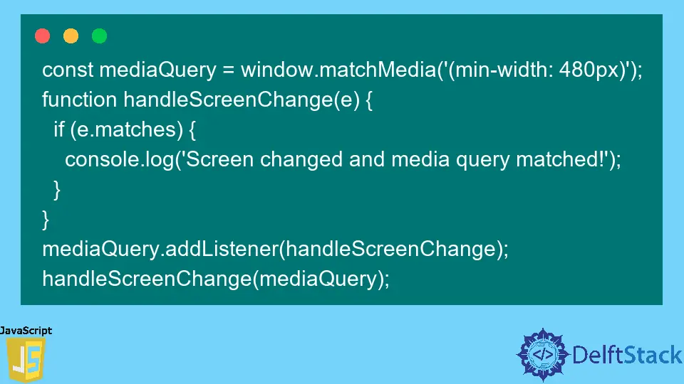
const mediaQuery = window.matchMedia('(min-width: 800px)');

function handleMediaQuery(e) {
    if (e.matches) {
        console.log('Wide screen layout');
        // Code for wide screen layout
    } else {
        console.log('Narrow screen layout');
        // Code for narrow screen layout
    }
}

mediaQuery.addEventListener('change', handleMediaQuery);
handleMediaQuery(mediaQuery);
Output:
Logs 'Wide screen layout' or 'Narrow screen layout' based on the viewport width.
In this example, we create a media query for screens that are at least 800 pixels wide. The handleMediaQuery function checks if the media query matches and logs a message accordingly. Using addEventListener instead of addListener allows for a more modern approach to handling media query changes. This method is beneficial for larger applications where you might want to execute various functions depending on the viewport size.
Combining Media Queries with CSS
While JavaScript offers powerful tools for handling media queries, combining these techniques with CSS can lead to even better results. For example, you can set up your CSS to handle most styling changes, while JavaScript can manage dynamic content changes. Here’s how you can do this:
const mediaQuery = window.matchMedia('(prefers-color-scheme: dark)');

function adjustTheme(e) {
    if (e.matches) {
        document.body.classList.add('dark-theme');
    } else {
        document.body.classList.remove('dark-theme');
    }
}

mediaQuery.addEventListener('change', adjustTheme);
adjustTheme(mediaQuery);
Output:
The theme changes based on the user's preferred color scheme.
In this snippet, we check if the user prefers a dark color scheme. If they do, we add a class to the body that can be styled in CSS. This method allows you to leverage both CSS and JavaScript effectively. By using CSS for styling and JavaScript for behavior, you can create a more maintainable and scalable codebase.
Conclusion
Media queries in JavaScript provide a powerful way to create responsive designs that adapt to various devices and user preferences. By utilizing methods like window.matchMedia, you can listen for changes in the viewport and adjust your web application’s behavior accordingly. Whether you’re changing styles, managing layouts, or adjusting functionality, understanding how to implement media queries in JavaScript is essential for any modern web developer. As you continue to build responsive applications, remember to combine CSS and JavaScript for the best results. Happy coding!
FAQ
-
What are media queries in JavaScript?
Media queries in JavaScript allow developers to apply styles and execute functions based on the viewport’s characteristics, enabling responsive design. -
How do I use window.matchMedia?
You can usewindow.matchMediato define a media query and listen for changes, executing a function based on whether the query matches. -
Can I combine CSS and JavaScript for media queries?
Yes, combining CSS for styling and JavaScript for dynamic behavior is a best practice for creating responsive web applications. -
What is the difference between addListener and addEventListener?
addListeneris an older method for handling media query changes, whileaddEventListeneris the modern approach that provides better compatibility and performance. -
How can media queries improve user experience?
Media queries allow web applications to adapt to various devices and user preferences, enhancing usability and accessibility for a wider audience.

Shraddha is a JavaScript nerd that utilises it for everything from experimenting to assisting individuals and businesses with day-to-day operations and business growth. She is a writer, chef, and computer programmer. As a senior MEAN/MERN stack developer and project manager with more than 4 years of experience in this sector, she now handles multiple projects. She has been producing technical writing for at least a year and a half. She enjoys coming up with fresh, innovative ideas.
LinkedIn