How to Slide in From Left Transition in CSS
- Understanding CSS Transitions
- Setting Up Your HTML Structure
- Writing the CSS for the Slide-In Effect
- Triggering the Slide-In Effect with JavaScript
- Conclusion
- FAQ
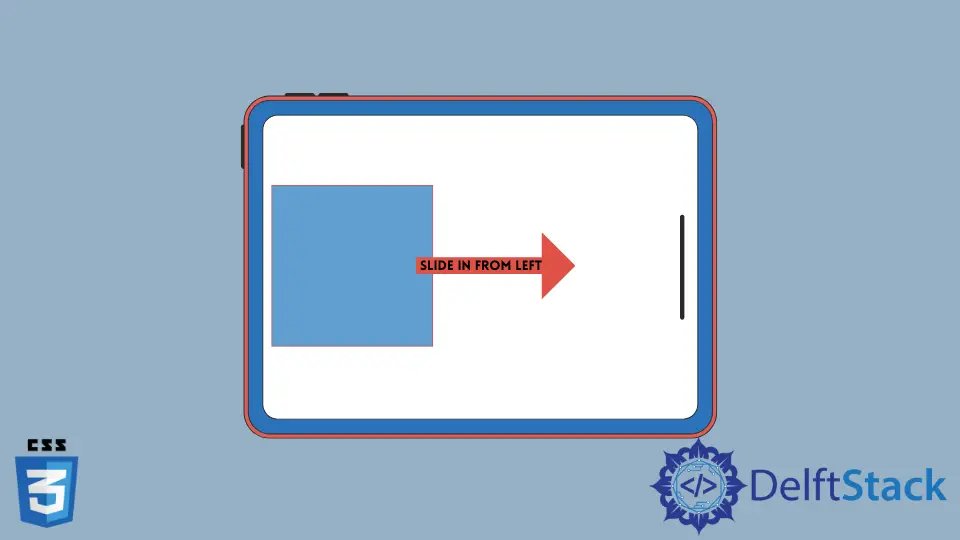
Creating visually appealing transitions can enhance user experience and engagement on your website. One popular effect is the “slide in from left” transition, which adds a dynamic touch to elements entering the viewport.
In this tutorial, we will explore how to implement this effect using CSS. You’ll learn about key properties like transform, transition, and how to combine them effectively. Whether you’re a seasoned developer or just starting, this guide will provide you with the necessary steps to create a smooth sliding effect that captivates your audience.
Understanding CSS Transitions
Before we dive into the code, let’s briefly discuss what CSS transitions are. A CSS transition allows you to change property values smoothly (over a given duration) from one state to another. This is particularly useful for creating animations without needing JavaScript or complex libraries.
To create a slide-in effect from the left, we will manipulate the transform property, specifically using translateX(). This property allows us to move elements along the X-axis, making it perfect for our sliding effect.
Setting Up Your HTML Structure
To implement the slide-in transition, you’ll need a simple HTML structure. Here’s a basic example:
<!DOCTYPE html>
<html lang="en">
<head>
    <meta charset="UTF-8">
    <meta name="viewport" content="width=device-width, initial-scale=1.0">
    <title>Slide In From Left Transition</title>
    <link rel="stylesheet" href="styles.css">
</head>
<body>
    <div class="slide-in">Hello, I slide in from the left!</div>
</body>
</html>
This HTML code creates a single div element that we will animate. The class slide-in will be used to apply our CSS styles.
Writing the CSS for the Slide-In Effect
Now, let’s move on to the CSS part. Here’s the code that will create the slide-in effect:
body {
    overflow-x: hidden;
}

.slide-in {
    position: relative;
    transform: translateX(-100%);
    opacity: 0;
    transition: transform 0.5s ease, opacity 0.5s ease;
}

.slide-in.active {
    transform: translateX(0);
    opacity: 1;
}
In this CSS code, we set the initial state of the .slide-in class to be off-screen (translated to the left by 100%) and fully transparent (opacity: 0). The transition property defines how the changes should animate over 0.5 seconds.
When we add the active class to the element, it will slide into view and become fully opaque.
To see this effect in action, you’ll need to trigger the addition of the active class, which can be done using JavaScript or by adding it on page load.
Triggering the Slide-In Effect with JavaScript
Now that we have our HTML and CSS set up, let’s add a little JavaScript to trigger the slide-in effect when the page loads:
window.onload = function() {
    const slideInElement = document.querySelector('.slide-in');
    slideInElement.classList.add('active');
};
This JavaScript code waits for the window to load, then selects the .slide-in element and adds the active class. As a result, the element will slide in from the left as soon as the page is fully loaded.
Output:
The element slides in smoothly from the left side of the viewport.
By combining these three components—HTML, CSS, and JavaScript—you can create a captivating slide-in effect that enhances your webpage’s interactivity.
Conclusion
In this tutorial, we explored how to create a slide-in from left transition using CSS. By understanding the key properties and how to manipulate them, you can add dynamic elements to your web pages that engage users and enhance their experience. With just a few lines of code, you can turn a static website into a visually appealing interface. Remember to experiment with different durations and easing functions to perfect your transitions. Happy coding!
FAQ
-
What is a CSS transition?
A CSS transition allows you to change property values smoothly over a specified duration. -
Can I use this effect on mobile devices?
Yes, CSS transitions are supported on most mobile browsers, making this effect mobile-friendly.
-
How can I customize the duration of the slide-in effect?
You can change the duration in thetransitionproperty in your CSS code. -
Is it possible to slide in from other directions?
Absolutely! You can modify thetranslateX()or usetranslateY()for vertical transitions. -
Do I need JavaScript for this effect?
While CSS alone can handle transitions, JavaScript helps trigger the effect at the right time, such as on page load.