How to Change an HTML5 Input Placeholder Color With CSS
- Understanding Placeholder Text in HTML5
- Changing Placeholder Color with CSS
- Browser Compatibility
- Additional Styling Options
- Conclusion
- FAQ
Changing the color of an HTML5 input placeholder can enhance the user experience on your website. By customizing the placeholder color, you can ensure that it aligns with your site’s overall design and branding.
This tutorial will guide you through the process of changing the placeholder color using CSS, making it simple and straightforward. Whether you’re a beginner or an experienced developer, you’ll find the information here valuable. Let’s dive into the world of CSS and explore how to make your input fields not only functional but visually appealing!
Understanding Placeholder Text in HTML5
Before we jump into the CSS magic, let’s clarify what placeholder text is. Placeholder text provides a hint or example of what the user should enter in the input field. It appears in a lighter shade than the actual input text, guiding users without being intrusive.
The default color of placeholder text is determined by the browser and can vary. This is where CSS comes in handy, allowing you to override these defaults and create a cohesive look for your web forms.
Changing Placeholder Color with CSS
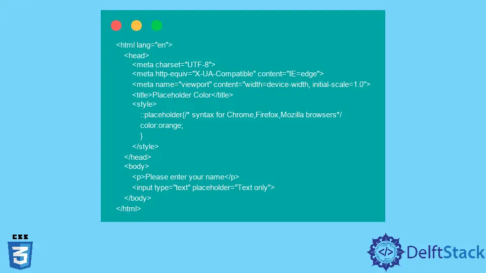
To change the placeholder color, you can use the ::placeholder pseudo-element in your CSS. This is a simple and effective way to customize the appearance of your input fields.
Here’s how you can do it:
input::placeholder {
    color: #888888; /* Change this to your desired color */
    opacity: 1; /* Ensures the placeholder is fully opaque */
}
In this code snippet, we define the color of the placeholder text by using the color property. The opacity property is set to 1, ensuring that the placeholder text is fully visible. You can replace #888888 with any color code that fits your design scheme.
Output:
The placeholder color will change to the specified color.
This method is widely supported across modern browsers, making it a reliable choice for web developers. By using the ::placeholder pseudo-element, you can easily integrate a unique style that enhances your site’s usability and aesthetic appeal.
Browser Compatibility
One of the key considerations when using CSS to style placeholder text is browser compatibility. While most modern browsers support the ::placeholder pseudo-element, older browsers may not. Therefore, it’s crucial to implement fallback styles for maximum compatibility.
Here’s how you can ensure broader support:
input::placeholder {
    color: #888888;
}

input:-ms-input-placeholder {
    color: #888888; /* For Internet Explorer 10-11 */
}

input::-ms-input-placeholder {
    color: #888888; /* For Microsoft Edge */
}
In this extended example, we add support for Internet Explorer and Microsoft Edge using vendor prefixes. This ensures that users on these browsers also see the custom placeholder color.
Output:
The placeholder color will be consistent across various browsers.
By incorporating these styles, you can maintain a uniform look and feel for your input fields, regardless of the user’s browser. This attention to detail can significantly enhance the overall user experience.
Additional Styling Options
In addition to changing the color, you can further style the placeholder text to improve its appearance. For instance, you might want to adjust the font size, weight, or even the text alignment.
Here’s an example that combines several styles:
input::placeholder {
    color: #888888;
    font-size: 14px; /* Adjust font size */
    font-weight: bold; /* Make placeholder text bold */
    text-align: center; /* Center the text */
}
In this snippet, we not only change the color but also modify the font size to 14px, make the text bold, and center it within the input field. These styling options allow you to create a unique and engaging input experience.
Output:
The placeholder text will now appear bold, centered, and in the specified size.
By experimenting with various styles, you can create a placeholder that stands out and complements your website’s design. This level of customization can make a significant difference in user interaction and satisfaction.
Conclusion
Changing the placeholder color of HTML5 input fields using CSS is a straightforward yet impactful way to enhance your website’s user interface. By using the ::placeholder pseudo-element and considering browser compatibility, you can create a visually appealing and user-friendly experience. Whether you’re a seasoned developer or just starting out, these techniques will help you design input fields that are both functional and attractive.
As you implement these styles, remember to keep your overall design in mind. A cohesive look not only improves usability but also reinforces your brand identity. Happy coding!
FAQ
-
How do I change the placeholder color for multiple input types?
You can apply the same CSS rules to different input types by targeting them with a common class or using a more general selector likeinput, textarea. -
Will changing the placeholder color affect the input text?
No, changing the placeholder color only affects the placeholder text. The actual input text will remain unaffected. -
Is the
::placeholderpseudo-element supported in all browsers?
Most modern browsers support the::placeholderpseudo-element, but you should include vendor prefixes for older versions of Internet Explorer and Edge for better compatibility. -
Can I animate the placeholder color using CSS?
Yes, you can use CSS transitions to animate the placeholder color when the input field is focused or filled. -
What is the best color for placeholder text?
The best color for placeholder text is typically a lighter shade that contrasts well with the input field background, ensuring it is visible but not overpowering.