Bootstrap Tooltip in AngularJS
- Setting Up Bootstrap in AngularJS
- Creating Tooltips in AngularJS
- Customizing Tooltips
- Styling Tooltips
- Conclusion
- FAQ
In today’s web development landscape, user experience is paramount. One way to enhance this experience is through the use of tooltips. Bootstrap tooltips, an open-source library, offer a variety of customizable features that make them an excellent choice for AngularJS applications. With options for animation effects, positioning, and placement, you can create a seamless and interactive experience for your users.
This article will delve into how to effectively implement Bootstrap tooltips in AngularJS, providing you with practical examples and insights that will empower you to elevate your web projects. Let’s explore the world of Bootstrap tooltips and how they can be integrated into your AngularJS applications.
Setting Up Bootstrap in AngularJS
Before we dive into creating tooltips, it’s essential to set up Bootstrap in your AngularJS application. You can do this by including Bootstrap’s CSS and JavaScript files in your project. You can either download Bootstrap or use a CDN link. Here’s how to set it up:
- Include Bootstrap CSS in the
<head>section of your HTML:
<link rel="stylesheet" href="https://maxcdn.bootstrapcdn.com/bootstrap/3.3.7/css/bootstrap.min.css">
- Include jQuery and Bootstrap JavaScript files before the closing
<body>tag:
<script src="https://ajax.googleapis.com/ajax/libs/jquery/3.5.1/jquery.min.js"></script>
<script src="https://maxcdn.bootstrapcdn.com/bootstrap/3.3.7/js/bootstrap.min.js"></script>
With Bootstrap properly linked, you’re ready to start implementing tooltips in your AngularJS application.
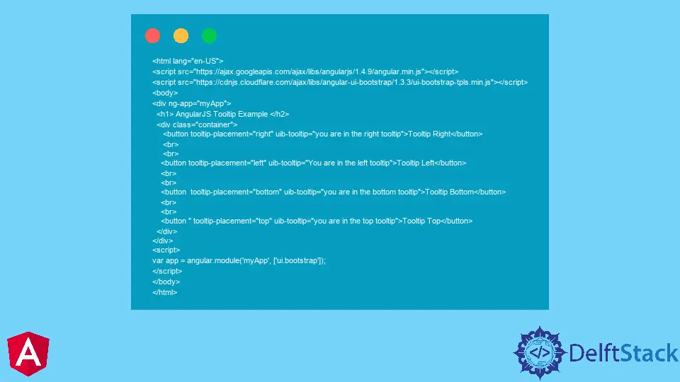
Creating Tooltips in AngularJS
To create a tooltip in AngularJS, you can use the data-toggle attribute provided by Bootstrap. This attribute enables you to easily add tooltips to any HTML element. Below is a simple example of how to create a tooltip:
<button type="button" data-toggle="tooltip" title="This is a tooltip!">Hover over me</button>

<script>
$(function () {
  $('[data-toggle="tooltip"]').tooltip();
});
</script>
In this example, we have a button with the data-toggle attribute set to tooltip. The title attribute contains the text that will be displayed in the tooltip when the user hovers over the button. The jQuery code initializes the tooltip functionality, allowing it to appear as intended.
Output:
Tooltip appears when hovering over the button.
This simple implementation demonstrates how easy it is to add tooltips to your AngularJS application using Bootstrap. The tooltip will appear when the user hovers over the button, providing additional context or information.
Customizing Tooltips
Customization is one of the standout features of Bootstrap tooltips. You can easily modify the appearance and behavior of tooltips to suit your application’s needs. For instance, you can change the placement, add animation, and even style the tooltip using CSS. Here’s an example:
<button type="button" data-toggle="tooltip" title="Customized Tooltip!" data-placement="right" data-animation="true">Hover over me</button>

<script>
$(function () {
  $('[data-toggle="tooltip"]').tooltip({
    animation: true,
    placement: 'right',
    delay: { show: 500, hide: 100 }
  });
});
</script>
In this code, the tooltip is configured to appear on the right side of the button with a delay for showing and hiding. The data-animation attribute is also set to true, allowing for a smooth transition when the tooltip appears.
Output:
Tooltip appears with animation on the right.
This customization allows you to tailor the tooltip’s behavior, making it more engaging for users. You can explore various options like changing the placement to top, bottom, left, or right, and adjusting the delay for showing and hiding the tooltip.
Styling Tooltips
While Bootstrap provides a default styling for tooltips, you may want to create a unique look that aligns with your application’s design. You can achieve this through CSS. Here’s how to style your tooltips:
<style>
.tooltip {
  background-color: #5bc0de;
  color: white;
  border-radius: 5px;
}
</style>

<button type="button" data-toggle="tooltip" title="Styled Tooltip!">Hover over me</button>

<script>
$(function () {
  $('[data-toggle="tooltip"]').tooltip();
});
</script>
In this example, we define a CSS class for the tooltip, changing its background color and text color to make it more visually appealing. You can also adjust the border radius or add shadows for a more modern look.
Output:
Styled tooltip appears with a custom background.
By applying custom styles, you ensure that the tooltips blend seamlessly with your application’s overall theme, enhancing user experience while maintaining visual consistency.
Conclusion
Bootstrap tooltips are an invaluable tool for enhancing user interaction within AngularJS applications. With their customizable features, such as animation effects, positioning, and styling, you can create a more engaging and informative experience for your users. By following the examples provided, you can easily implement and customize tooltips to fit your specific needs. As you continue to develop your AngularJS applications, consider leveraging Bootstrap tooltips to provide additional context and improve user engagement. Happy coding!
FAQ
-
What is a Bootstrap tooltip?
A Bootstrap tooltip is a small pop-up box that provides additional information about an element when a user hovers over it. -
How do I enable tooltips in AngularJS?
You can enable tooltips by including Bootstrap’s CSS and JavaScript files, then using thedata-toggleattribute in your HTML elements.
-
Can I customize the appearance of Bootstrap tooltips?
Yes, you can customize the appearance by modifying CSS styles and configuring tooltip options in your JavaScript code. -
What are some common use cases for tooltips?
Tooltips are commonly used to provide additional information, explain features, or offer guidance on form fields within web applications. -
Are Bootstrap tooltips accessible?
Bootstrap tooltips can be made accessible by ensuring they are keyboard-navigable and providing appropriate ARIA attributes for screen readers.

Muhammad Adil is a seasoned programmer and writer who has experience in various fields. He has been programming for over 5 years and have always loved the thrill of solving complex problems. He has skilled in PHP, Python, C++, Java, JavaScript, Ruby on Rails, AngularJS, ReactJS, HTML5 and CSS3. He enjoys putting his experience and knowledge into words.
Facebook