How to Understand Concept of Angular 2 ng-disabled
- What is ng-disabled?
- How to Use ng-disabled in Angular 2
- Advanced Usage of ng-disabled
- Conclusion
- FAQ
In the world of Angular 2, directives play a crucial role in enhancing the functionality of your applications. One such directive is ng-disabled, which allows developers to control the disabled state of form elements dynamically. Understanding how to use ng-disabled effectively can significantly improve user experience and form validation in your Angular applications.
In this article, we will dive deep into the ng-disabled directive, exploring its syntax, use cases, and how to implement it in your Angular 2 projects. Whether you’re a beginner or an experienced developer, this guide aims to clarify the concept and provide practical examples to help you master ng-disabled.
What is ng-disabled?
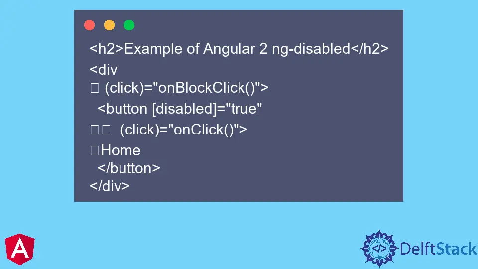
The ng-disabled directive in Angular 2 is used to enable or disable form elements based on a given condition. This directive can be applied to various HTML elements like buttons, input fields, and select dropdowns. By binding the ng-disabled directive to a boolean expression, you can control whether a user can interact with a specific form element. This is particularly useful for scenarios like form validation, where you want to prevent users from submitting incomplete or incorrect data.
For instance, if you have a button that should only be clickable when certain conditions are met, you can use ng-disabled to manage its state. This enhances the user experience by providing immediate feedback and preventing errors.
How to Use ng-disabled in Angular 2
To effectively use the ng-disabled directive, you need to understand its syntax and how to bind it to your application logic. The basic syntax involves using the directive within the HTML element and binding it to a boolean expression in your component’s TypeScript file.
Example of Using ng-disabled
Here’s a simple example that demonstrates how to use the ng-disabled directive in an Angular 2 application:
<form #myForm="ngForm">
  <input type="text" [(ngModel)]="username" name="username" required />
  <button type="submit" [ng-disabled]="!myForm.valid">Submit</button>
</form>
In this example, we have a form with a text input for a username and a submit button. The button is disabled when the form is invalid. The ng-disabled directive is bound to the myForm.valid property, which evaluates to true or false based on the form’s validity.
Output:
Button is disabled when the form is invalid
This implementation ensures that users can only submit the form when they have entered a valid username. The ng-disabled directive enhances form validation by preventing the submission of incomplete forms, which can lead to better data integrity.
Advanced Usage of ng-disabled
While the basic usage of ng-disabled is straightforward, there are more advanced scenarios where you can leverage this directive to create dynamic and responsive forms. For instance, you might want to disable a button based on multiple conditions or user interactions.
Example of Advanced ng-disabled Usage
Here’s an example that illustrates how to disable a button based on multiple conditions:
<form #myForm="ngForm">
  <input type="text" [(ngModel)]="username" name="username" required />
  <input type="password" [(ngModel)]="password" name="password" required />
  <button type="submit" [ng-disabled]="!myForm.valid || password.length < 6">Submit</button>
</form>
In this example, the submit button is disabled not only when the form is invalid but also when the password is less than six characters long. This ensures that users meet specific criteria before they can submit the form.
Output:
Button is disabled if form is invalid or password is less than 6 characters
By using logical operators in the ng-disabled directive, you can create complex validation rules that enhance user experience and ensure data quality. This flexibility allows you to tailor your forms to meet specific requirements, making your application more robust and user-friendly.
Conclusion
Understanding the ng-disabled directive in Angular 2 is essential for creating interactive and user-friendly applications. By mastering this directive, you can control the state of form elements dynamically, enhancing both usability and data integrity. Whether you’re implementing simple form validation or more complex conditions, ng-disabled provides the flexibility you need to build effective user interfaces. As you continue to explore Angular 2, remember that leveraging directives like ng-disabled will help you create better applications that meet user expectations.
FAQ
-
What is the purpose of ng-disabled in Angular 2?
ng-disabled is used to enable or disable form elements based on a boolean expression. -
Can ng-disabled be used with any HTML element?
Yes, ng-disabled can be applied to various HTML elements like buttons, input fields, and select dropdowns. -
How does ng-disabled improve user experience?
By preventing users from interacting with disabled elements, ng-disabled helps avoid errors and ensures data integrity. -
Can I use multiple conditions with ng-disabled?
Yes, you can use logical operators to combine multiple conditions for more complex validation scenarios. -
Is ng-disabled only for forms?
While commonly used in forms, ng-disabled can be applied in other scenarios where you need to control element interactivity.

Muhammad Adil is a seasoned programmer and writer who has experience in various fields. He has been programming for over 5 years and have always loved the thrill of solving complex problems. He has skilled in PHP, Python, C++, Java, JavaScript, Ruby on Rails, AngularJS, ReactJS, HTML5 and CSS3. He enjoys putting his experience and knowledge into words.
Facebook